
Unit 10: Engaging With An Audience (Advertising Campaign Production)
- 40084662thesecond
- Nov 4, 2021
- 93 min read
Updated: Mar 8, 2022

What's This Unit All About?
In this unit, we'll be delving back into the world of advertising campaigns and target audiences, and this time around it'll involve doing a multi pronged marketing scheme that involves a photo shoot of a bunch of sandwiches and a moving image advertisement for any product of our choosing.
For those of you that followed me last year, this is going to sound familiar, especially the moving image advertisement, as I've actually already done something similar back in creative media level 2 where I created the character of "Sello-Man" as a means to make an advertisement for Sello-tape:
The main difference this time around is that instead of a 30 second advert, now we'll be making a 20 second advert but it can be for whatever product we choose instead of being limited to Sello-tape. (so in essence, we get creative freedom at the cost of around 10 seconds of potential air time)
As such, the research for this project will mainly revolve around other advertisement campaigns as well as my least favourite bit of creative media, demographic research (mainly due to how dull I know it's going to be), as such I'll have to find a way to make this part interesting. Luckily the project doesn't officially start until the 15th of November so I technically have a head start. (not to mention I already have an idea or two involving my personal project cooking as to what the moving image advert could be, but I'll delve a little more into those later):

What Is An Advert, Why Are They Made And How Do They Impact The Things People Enjoy?
An advertisement (also known as an "advert", an "ad" or in America, a "commercial") is a piece of media that is specifically designed to promote and sell a particular product or service in order to help the company (or companies if there are multiple corporate parties involved) behind said product/service turn a profit by convincing as many people as possible to buy into said product/service, whether it be a music concert, a TV, a games console, a car, another piece of media such as movies and video games, a restaurant, a computer, a piece of software, a subscription service, ext.
These adverts can be see in all sorts of places from time square in New York City where they're displayed on giant screens to movie cinemas where they'll play before the trailers for other films (which themselves play before the film you paid to see, so that's two layers of promotion before the movie even begins) and even on the internet where they can play before, during or even after the video you want to watch. However, the most well known place where advertisements can be found is on television, where they typically play every so often during a tv program such as The Simpsons, Rocko's Modern Life or even Chowder, these TV adverts often have a role as to why these shows (as well as plenty of others) will randomly fade to black and then cut back to a similar looking shot afterwards since in between the fade to and from black, the adverts would be slotted into their allotted window of time. (meaning once the VHS, DVD and/or Blu-ray release comes out and there are no ads within the episodes anymore, the show just seems to cut off randomly)
For example, let's say you were at home watching the first episode of Sonic X on your television set:
During the moment where we see the leader of the S-team staring off into the distance as the camera slowly pans upwards while the rest of the team goes off to chase Sonic, the screen would fade to black and then once the channel does it's little "after these messages" bumper, a bunch of adverts would start playing:


These adverts actually depend on what channel you're watching, so if you're watching Cartoon Network, you'd likely see a lot of adverts for things such as Toys, Video Games, sweets, family films that are either in cinemas or on DVD with the odd insurance or car advert or plastered in there for the parents. Likewise, if you were watching a more adult channel like Adult Swim (which is actually what Cartoon Network turns into at night), you'd be more likely to come across adverts for things such as beers and adult rated films. (I would give more examples, but I don't think I'd be able to get away with listing the more risqué adverts that are on adult oriented TV channels) The reason for this is because the companies behind the adverts actually have to pay the people who run the channel for what is known as "Ad space", meaning that SEGA would have to pay the people who run Cartoon Network in order to get their advert for the next Sonic game on the airways in the first place. As such, this means the networks can make money via the ad revenue coming in thanks to these big payments (which happen very regularly) while the companies make money from the sales that result from their adverts being played on network television.

This is also the reason why a show like Sonic X is able to have a half an hour time slot despite only having 21 minutes and 15 seconds of actual content dedicated to the actual show itself (at least in this specific episode anyway, the length between episodes can vary from 19 minutes to 21 minutes)
One major benefit to making a television advert is that they can air multiple times during a single day, thus meaning if someone misses it once, there's a good chance that the viewer may end up catching it later on in the day when they're watching something else on the same channel. For example, it might play once during a showing of Sonic X and then later on when they're showing something The Iron Giant, that same advert would play once or twice more during the film's respective ad breaks, thus giving the corporation multiple attempts to push their products within a single day. The main drawback with this kind of advertising however is that if the viewers aren't tuned in during the ad breaks (perhaps they may have either switched over to another channel, went to the bathroom, decided to play video games instead, they may not have the TV turned on in the first place or in rare circumstances they might not even own a television to begin with), they'll end up missing the advert in question. (thus meaning the company may have lost out on a potential sale if said viewers didn't even watch the channel the advert was placed on)
Ok, But What Other Types Of Adverts Are Out There?
Alongside television adverts, you can also find "still adverts", these are still images that are created for the same purposes as television adverts except unlike TV where you've got 10-60 seconds to convey what your product and/or service is all about, still adverts only have a single frame to tell the audience everything they need to know about your product and/or service before they decide whether or not they want to buy into your product/service.
Unlike TV adverts where the audience have to actually tune into a television channel to view them, stills adverts are often found in the outside world in public places such as train-stations, Newspapers, Time Square, bus stops and even the buses themselves:

Another way that billboards and other forms of stills advertisement differentiate themselves from that of the TV advert is that they can often range in size depending on where you find them, for example, if they were in a newspaper or a fashion magazine they would only be able to take up a double spread at most (with some adverts choosing to only take up one page or even less), where as if you were to find a stills advert on a billboard on the motorway, it would be quite big:


While we're on the topic of billboards, I should also mention that there are two types of billboards in the world these days, one is the more traditional billboards that are printed across multiple separate sheets of paper and then stitched together onto a massive empty board where they're displayed for a small while, this could range from a 4 weeks to an entire year according to Adquick.com, afterwards they're replaced with something else that's either made by the same company who did the original or by someone different depending on who's willing to pay the local billboard agency of that area more money.
The other type of billboards that exist today are "digital billboards". This type of billboard follows the same basic principal as their more traditional counterparts except instead of being printed in pieces that then get stitched together on the board itself, it's a massive screen that's able to display several images by rotating between the images every few seconds just like the posters you see on bus stops, only instead of physically rotating between the images, it fades between each image instead (plus a digital billboard can technically contain as many images as it needs to), and thanks to the nature of these billboards being on screens rather than static pieces of paper, companies can even turn their traditionally static advert into a video if they wanted to, thus getting the benefits of advertising on billboards while also reaping the benefits of making a video. (you can find these video-billboard hybrids all over the globe, especially in Time-Square):

Speaking of benefits, the main benefit of making a billboard advert is that you aren't reliant on your audience having a television set and tuning into a specific channel at a specific time in order to catch sight of it, plus they're non intrusive due to the fact they just so happen to be on the side of the road as you're driving along. (meaning if you catch sight of one out of the corner of your eye while in a traffic jam or while walking) Combine that with the fact that they also have a little bit more staying power in a person's mind (especially if said billboard happens to be a part of the route you take to get to and/or from places such as work or school) and you've got yourself a versatile yet non intrusive form of advertisement on your hands. The main drawback to doing billboard advertisement is that they're often found in more high traffic areas such as big cities (I.E: Liverpool or New York City), so people who happen to live in more rural areas aren't as likely to come across these types of adverts as someone who lives in a big city. (although with that in mind, social media can actually mitigate this particular drawback to an extent, especially for those that are part of the younger generation)
Another way that companies could advertise their products or services exist via the radio. This form of advertising works in a similar vain to that of a television advert except the company don't get to visually show their product since most radios don't rely on visuals because many stations usually exist to play music with the odd news segment and/or prize giveaway sprinkled in here and there. (they even have to pay for 10-30 second slots in the same way as television)
As such, companies who choose to use this form of advertising would have to rely on the listeners using their imagination in order to picture how the product would help them solve their problem and/or achieve a certain lifestyle. This lack of visuals can actually lead to some creative advertising campaigns by various companies such as what 20th Century Fox (now re-named 20th century studios thanks to Disney owning Fox's entertainment brands) did back in the 1977 to promote the first Star Wars movie (back when it was known as "Star Wars" and not "Star Wars Episode 4: A New Hope"):
My favourite adverts out of this particular lot are actually the first two because of the formula behind them where sound effects from the film would play while the narrator re-assures the audience "don't be alarmed, it's only [Scenario X]" twice before telling the audience "relax, it's only a movie, and it's all for fun" as the film's score kicks in. What I like about these adverts in particular is the playful, nonchalant tone they go for (I especially like the part where he reassures the audience "don't be scared, it's only the Death Star destroying another world" because of the contrast between this big scary thing against the chilled out tone of the narrator as he describes the event that just happened), thus helping them to better relate with their target demographic which would have been sci-fi fans who were yearning for a big blockbuster sci-fi flick. (but primarily older kids since the film itself doesn't contain any blood and it had a PG rating when the film came out)
The main benefit to doing a radio advert is that anyone who owns a radio and/or drives a car with the radio turned on can tune into your advert while waiting to listen to whatever the main content of their preferred radio station happens to be (whether it be music, the news or some other niche), and since your advert is likely to play multiple times per day, it means it'll follow the listener wherever they go during their trip. The main drawback however is that much like on television where the TV has to actually be turned on in order to have an impact on, radio adverts won't have any effect on the listener if they don't actually turn on the radio to begin with, and even if they do, your advert is less likely to be played on certain stations than it would on others. (much like on TV where adverts for certain products won't ever air on certain channels)
Now that we've taken a brief look at just a few of the ways companies can advertise to their target audience, let's take a look at the audiences themselves.
What's Are Demographics? And How Do They Relate With Target Audiences?
"Demographics", as they're referred to in the context of the media industry, relate to various characteristics that people have, I.E: age, race (also known as "ethnicity"), nationality, marital status, gender, wealth (also known as "income" or "class"), body type, political beliefs, ability, sexual orientation, what hobbies they enjoy partaking in, ext.
The reason companies like to split people into demographics like this is because when they're making a product and/or service, they'll usually have what's known as a "target audience" they want to push said product/service towards. For instance, if they were selling something like a gaming PC, you'd probably want to target people who like playing video games within the advertising material, specifically those that have a lot more technical knowledge about the various components than I'll ever have. (stuff like graphics processing units, cooling fans, audio cards and the like) Likewise, if you were selling something like a toaster, your audience would be a lot more generalised. (albeit, still mostly adults because unless a child was really into The Brave Little Toaster, I highly doubt most children are going to want a toaster of their very own) As such, companies who want to sell a product to a specific audience will often conduct market research in order to determine what their target audience wants and then pivot the marketing to suit what the audience wants to get out of the product, whether it be solving a problem or living a lifestyle. Examples of market research can include things such as focus groups, surveys, test screenings (specifically for movies), ext.

For example, according to this study of people who watched family and kids movies from 2017, 32.9 percent of the 376 that were asked when they started planning to go and watch a family movie (who themselves made up around 71.6 percent of the 500 people they asked total) said they started planning to watch said films after they read/hear reviews and/or recommendations from friends and family members (with 41.8 percent being female while the other 28.6 percent happened to be male), where as only 15.4 percent of those who were asked said they planned to watch them as soon as the trailers were out (with 14.1 percent being male and 18.2 percent being female), meaning they often plan months or even years ahead of time depending on when the initial trailer comes out. I should point out however that this study doesn't specify whether the "trailer" section refers to the teaser trailers that usually come out first and often a year or two before the film's release as is the case with the recent Lightyear trailer:

or if it means the trailers that release afterwards, but I personally feel safe in assuming they mean the teaser trailers. Going back to the statistical side of things. Going back to the statistics for a moment, a whopping 23.5 percent of respondents said they started planning to go and watch family films on the same day as the film's release. (with 26.3 percent of those respondents being male while the other 17.5 percent happened to be female) But before I explain the way I feel about these findings, I should preface it by telling you that what I'm about to say is under the assumption that ALL the respondents are parents, of course this is a rather silly assumption to make due to potential outliers, this particular survey doesn't clear up whether any of the participants weren't parents. With this in mind, here's how I feel about what I found out. (oh, and do keep in mind that this study was conducted in 2017, so things may have changed slightly since then, thus making the numbers inaccurate by 2021 standards)
While I was expecting a good majority of the audience members surveyed to be female (specifically for the "after hearing recommendations/reviews from friends, family and/or film critics), what I wasn't expecting (at least when I first came across this study) was that more females than males would start planning to watch family films as soon as the trailers came out because it meant they would be planning these films months or even years in advance, but as I was writing this very paragraph you're reading now, I ended up coming to a bit of a realisation where I thought to myself "oh yeah, it's not usually the parents that want to see these movies, it's the children," and as such the logical explanation for this is that since the children are accessing these trailers via the internet (especially in our modern times where they have access to computers and smartphones), meaning the kids who watch the trailers for films like Lightyear and Sonic The Hedgehog are more likely to beg their parents to take them to the cinema. I know this because I did the very same thing with films such as Pixar's Wall-E back in 2007 (it was all I ended up thinking about that year in primary school to the point where I tried to watch it in places such as Centre Parcs despite the fact it wasn't actually out yet, good times), and nine times out if ten, it's usually the mother that gets asked rather than the father, so of course this statistic ended up making much more sense to me in hindsight.
Media Audience Theories
When it comes to audiences in media, there are three main theories that companies usually like to follow when it comes to how their audiences connect with the media they're consuming, I will go over these theories in their own headings in order to make it easier for you and I to digest the information in manageable chunks, starting with...
The "Hypodermic Needle" Theory
The Hypodermic Needle theory is the oldest and most linear one out of the three theories because it suggests that the media and the audience watching it share a one way relationship where the audience get entertained, informed and/or advertised to by the media and that such consumption can actually influence the way the audience think and feel. This theory was developed during the first half of the golden age of Hollywood (in this case meaning the 1920s and 1930s) when people observed the effects of things such as World War 1's propaganda (from both the allied forces and the enemy) as well as the War Of The Worlds broadcasts done by Orson Welles that supposedly caused a big scare across the United States:

Had I not found that little titbit out, I probably would have used the supposed radio scare as my main example of the effects of the hypodermic needle theory without even realizing that I'd fallen victim to it myself. This just goes to show that you shouldn't believe everything you read or see, whether it be in a newspaper, on the internet and/or on television, or else you'll make a fool out of yourself.
The reason the newspapers exaggerated the extent of the panic (at least according to the news article I found) is actually quite interesting, as the motive behind all this was seemingly to demonise the medium of radio (and to a lesser extent, Orson Welles), which during the great depression was a new medium that was becoming a serious competitor to newspapers in terms of news and advertising, so that more people would implicitly believe that radio as a medium and the people who used it for storytelling purposes were irresponsible and could do massive damage if left unchecked:

I find this quite interesting because I find that the way the newspapers handled this particular program and the drama they created around it is quite similar to the modern disdain that news outlets seem to have towards violent video games (and to a much lesser extent violent movies) and how they supposedly lead to violent behaviour:

The reason I think this is a load of nonsense as a person who's been playing video games from a very young age is because of the fact that many other studies have been conducted before, during and after the time of this report (if you can even call it that) that have shown that video game violence is actually not actually linked with violence in young people, one of which was even cited by CBS News themselves in 2019 (make of that what you will):

I think the reason that some people (mainly parents and politicians) may have come to the conclusion is that newspapers and other news outlets have been levying against gaming ever since the release of a game called "Death Race" in 1976, as that was the earliest game to depict violent acts, and ever since then, news outlets have been scrutinising gaming as a medium to the point where a lot of parents started accepting the narrative of video games corrupting the youth as fact (a perfect case of hypodermic needle theory if I do say so myself):

To be honest, I'm surprised the parents and media aren't going after the literal gambling mechanics that use real world money in "E" rated sports games, but I'm getting off topic.
While this theory is considered outdated by modern standards due to the vast amount of media and fact checking resources available to the public thanks to the internet, the fact that the debate on video game violence is still being discussed despite the overwhelming evidence saying video games don't cause violence and also the fact that some fanatics on the political left and right will believe anything their wing's given politicians say without question (especially during elections), I'd say this particular theory still holds a little bit of water in today's society (in some cases it holds more weight than it's ever held before), but now it's time to move on to a theory that people consider to be more relevant, that being...
The Reception Theory
The reception theory (applied by a guy named Stuart Hall in the 1970s) states that no, audiences are not as heavily impacted by media as people in the 1930s originally thought and that instead they'll form their own opinions and/or their own interpretations for every piece of media they come across and decide to view or listen to.
The idea behind this theory is that the producers of various pieces of media (mainly films, television and video games) will hide various 'codes' for the audience to pick up on and then it's up to the audience to interoperate these codes in order to decipher the meaning of them. These codes can come in many different forms, from the way a particular scene is lit, I.E: if a scene is particularly bright then it's safe to assume that it takes place in broad daylight or in a particularly well lit room (bright colours also mean that things are going quite well), where as if it was quite dark, you can easily assume that the scene either takes place at night or in a dark cave somewhere which can make the audience feel uneasy (this isn't always the case because the lighting can sometimes be stylised):


The appearance and personality of the cast could also be used to send signals to the audience. For example, if a character were small and round, most audiences would consider them to be quite friendly:

Likewise, if the character were to have hair that was shaped and coloured like a flame and be given an evil glare, the audience would likely catch that said character is a bad dude:

Under this theory, the audience can end up interpreting a given piece of media in one of three different ways (those being the sub-sections of this theory), if they were to end up interpreting the piece of media in the way that the producers intended (I.E: if they read the character of Syndrome as a villain), this is referred to as the dominant reading because in theory, most of the audience would be on the same page as the producers. An example of the dominant reading is that many people view Mario as the hero of the Super Mario series because of how happy-go-lucky he is and the fact that he's the main playable character:

The second viewpoint the audience may lean towards is known as the negotiated reading, where the audience may not entirely agree with the content or the way it's presented but they're willing to compromise because they understand why the other side thinks the way they do. An example of this reading is that some people may not necessarily view Mario as the good guy of the game because he's always jumping and throwing fireballs at various creatures, I.E: Goombas, Koopa Troopas, Cheep Cheeps and the like (plus in Super Mario Odyssey he literally possesses the various creatures without their consent) but since he's the player character they're willing to go along with it anyway:

However, if the audience were totally at odds with the morals and/or content of the piece of media (I.E: if they were super against Mario because he kills a bunch of creatures in his games and/or wears suits that are based on raccoons and the like), then they would fall under the "Opposition reading":

my view of this piece of media made to criticise Nintendo for promoting things they don't even promote would place me in the opposition reading myself but it's time to move onto the third and final theory since I suddenly need to get this section done in a hurry so I can move on to the production side of things (meaning once again the research side is getting gutted to the point of absurdity)
The Gratification Theory
The gratification theory is actually the most audience centric of the bunch, as it relates to what the audience does with the media they consume rather than what the media does to the audience.
In a nutshell, this theory is about how audiences will actively seek out media that fulfils a certain need or want they may have, whether it be escapism (stuff like Sonic The Hedgehog 2 and The G-Mod Idiot Box series), motivation (motivational videos on the internet and talent shows), social reasons (which gets fulfilled by talk shows and even film discussions on the internet) or even to educate themselves on a given topic they happen to be passionate about (for me, this is Dreams tutorials and random educational videos by channels such as Wendover Productions), as such I'm going to take a slightly different approach with my main examples, as I'm going to get a little bit more personal in this section (since this theory as a whole has a more personal touch), so without further ado let's dive right into my first example.
Escapism: Come and Learn with Pibby!
Video uploaded by Adult Swim (Warning: This video contains blood and themes some may find mildly disturbing)
The basic premise of this short is that it's structured like a trailer for a currently fake series where a big evil glitch blob is going around the cartoon multiverse corrupting everyone and everything it comes across, turning beloved characters such as Bugs Bunny and Fred Flintstone into glitchy husks of their former selves and it's up to a character from a fake pre-school show named Pibby, a generic super hero sidekick and a generic Disney villain to come together to put an end to this and save the cartoon multiverse as they know it.
Usually, I don't really dig "horror" content (nothing wrong with the genre I just get scared easily), much like with the Don't Hug Me I'm scared series, I actually really like the concept behind this short because of the meta-fictional nature of the situation at hand, the mystery as to what this glitch monster is and where it came from and the fact that (much like in Space Jam: A New Legacy) a lot the corrupted characters we see are characters from real Warner Bros cartoons with people such as Finn the human and Jake The Dog from Adventure Time, Bugs Bunny and Porky Pig from the Looney Tunes, Scooby Doo and Shaggy from Scooby Doo and even George Jetson from The Jetsons and Gumball Watterson from The Amazing World of Gumball. I think the use of existing characters in this case actually adds to the more serious and creepy tone because a lot of people are very attached to many of these characters (myself included), and thus seeing them all fall victim to the glitch and then end up under it's control as they try assimilating our main heroes will immediately make the audience feel uneasy (although even without the existing characters, the meta-fictional nature of this threat would be enough to make anyone feel creeped out):

Another really great element I touched upon briefly which also adds to the creepy vibes is the mystery surrounding much of this short (I.E: where did this glitch come from, why is it doing this and how are Pibby and friends going to stop this), thus allowing people's imaginations to fill in the blanks and share their interpretations with others on the internet:

This in combination the memes of various pop culture icons such as SpongeBob getting corrupted by the glitch in a similar vain to the memes surrounding Galeem from Smash Ultimate killing everyone with his light attack from the opening cutscene for the World of Light campaign also happens to end up boosting awareness for this short to begin with, thus making it more likely that it'll eventually turn into a real series. (fingers crossed)
There's a lot more I could get into here, but unfortunately, I'll have to cut this part short due to time constraints because they want us to move on to the practical side of things soon (so much for my head start)
Education: Wendover Productions
This category is going to be slightly different, as here I'll be discussing an entire YouTube channel rather than a specific video since a lot of the videos are presented in a similar style. (I just chose the freight train video because it's my personal favourite out of the bunch)
What I really like about this particular channel (as well as it's more humorous sister channel, which is called Half As Interesting) is the way that the guy running the channel (who incidentally enough is also called "Sam") explains his subject matter in a way that is clear and concise in combination with related visuals (be it stock footage of a freight train going by or a visual diagram showing the cost per "ton kilometre" when compared to transporting freight by truck) so that even someone like me can have a better understanding of the subject matter of the video:

The fact that this style of educational video can make subjects such as freight trains and the logistics behind overnight shipping sound interesting to a guy like me who's main interests are animation and gaming represents a philosophy that literally any subject in the world can be made interesting and easy to understand if taught via the right means and under the right circumstances.
I also like the wide variety of content on this particular channel, as there also exist videos about the logistics of delivering the COVID vaccines, what airlines do after a plane has already crashed as well as how card counting works. The reason I like the sheer variety of content here is because it means there's a high chance I'll be able to learn something new, and since I'm choosing to watch these videos rather than being forced to watch them by a school teacher (no offence to the teachers), I'm a lot more likely to retain more of the knowledge overall, plus I simply like the convenience of being able to have them on in the background while doing something else (I.E: Gaming) thanks to the fact that I can access them on my phone.
Social: Let's Play videos
When it comes to the different types of content, I don't have much of an affinity for the "social" category of content (you know, talk shows and the like), so for this example I'll be looking into why people seem to like "Let's Play" content.
What's Let's Play Content?
To put it simply, "let's play" content (also known as "gameplay walkthroughs") can be boiled down to people on the internet playing through various video games (this could be anything from Super Mario Odyssey to Minecraft) often with running commentary of what they're currently doing in the game, talking about their lives and/or engaging with their audience. (that third point is especially true if the let's play is being done via live streams rather than traditional videos) This type of content surfaced on YouTube in 2007 (after being popular on the "Something Awful" forums for years) and the genre and it's community have continued to evolve over the years until we reach today's let's plays with big personalities such as Markiplier and Jacksepticeye
So What Makes Them So Popular?
I think the reason this type of content is so popular, especially with younger audiences, is that you're not just watching raw gameplay footage of a video game like what you would find in places such as trailers and/or gaming conventions such as E-3 (unless the creator of the video decides not to add in any commentary), there's also that human element to the experience where you're watching a real person playing a game and giving their reactions to what's going on in the game (whether they're failing in a hilarious manner at a difficult part of the game or they're discovering hidden Easter eggs in said game) or if they're just discussing their thoughts and/or memories of said game, especially if said game is part of or a spiritual successor to an older series of titles like the Mario series, the Sonic series or even the Spyro series.
Another unique element of this type of content that contributes to it's continued popularity is the fact that the audience and the creators of the videos can actually interact with one another even after a let's play video has been uploaded, be it via the comments section where people will often be reacting to particular moments in the video or giving advice on how to get better at the game in question or even via the community tab feature where the let's player can inform their audience of their current goings on in ways that are unlike those that most traditional celebrities wouldn't be able to, mainly due to the fact they have to sign NDAs (Non-Disclosure Agreements) before getting to work on a film as to avoid any spoilers getting out, not to mention the fact that most of the popular let's players aren't traditional celebrates (I say most because people like Jack Black have also hopped on to doing let's plays themselves), thus making the audience more likely to form a personal connection to these people in the first place.
Motivation: A+ STUDENT MENTALITY-Best Study Motivation (yes, that last part is actually part of the title)
Normally I'm not one to actively watch motivational videos like this one (maybe I'll watch them here and there when I get bored but other than that, I don't really do this often), so this time around I'll be analysing the features that can take a video from being a normal video to a motivational one
What Ingredients Make A Video Motivational?
Motivational videos are actually made out of the same basic ingredients as a regular video (video footage, music and voice acting), the main difference between a motivational video and a regular video is the way they mix those ingredients together, because where as in a regular video these ingredients are used to serve the story by emphasising the visuals (which often involves special effects) and the sound design (sound effects, music and dialogue), a motivational video will usually place a greater focus on the message of the video (whether it be trying to inspire students to study or trying to get people to put a stop to climate change) by focusing more on the dialogue, which is often directed right at the audience, over everything else, which means that the footage used will often be stock footage the creators bought on the internet. (although there do exist channels such as Prince Ea who choose to film their own footage instead)
What Do I Like About The Video I Found?
One feature I really like about the A+ student video is the fact that throughout the video, there's subtitles placed in the centre of the screen so that if a student watching the video happened to be deaf, they could read the subtitles instead and find motivation from the video that way:

Another feature that I like in this video is the way the guy in the video will sometimes repeat certain phrases such as "Turn your pain into progress" throughout certain parts of the video because the use of repetition makes that particular phrase more likely to stick in the minds of the students who would likely encounter the video (assuming they watch the whole thing anyway), thus giving them the motivation to move forward with their studies for their upcoming exams. (since that's the main purpose of this video)
I also find that the person who says this speech (who as it turns out is a guy named Marcus Taylor) says everything nice and clearly so that people will be more likely to understand the whole thing even without the subtitles, and throughout the speech there'll be times where one minute, he'll be shouting his words at the top of his lungs and then the next, he'll speak a little bit quieter which to me, shows that he's quite passionate about what he's saying, thus making the students watching more likely to want to make this guy proud. (And as we all know, things that have a lot of passion and effort behind them are a lot more likely to be remembered and talked about years later than something with next to no effort or passion put into it)
So How Was The Main Research Phase?
While I'm glad I got to look at things in a bit more detail near the beginning, particularly with the different types of adverts, since I was able to get a full two weeks head start on it (meaning I had double the time to get this part done, which is closer to how things were last year), I still didn't end up having enough time to go into as much detail as I wanted to about things such as the gratification theory and I never even got to list any examples of TV adverts or billboard adverts, but I did manage to get at least one radio advert campaign example down in the form of the Star Wars adverts from 1977, so that's something to be proud of at least.
Another factor I think weighted me down in terms of the research is the fact that I'm personally not all that interested in the subject of target audiences and/or demographics in general, I personally find it quite dull and would much rather make whatever I think will be a good piece of media and just hope that audiences enjoy it too. Don't get me wrong, I can see why having a target audience is important, as you wouldn't want children or the elderly to watch a wildly violent, profanity filled video for example, but for the most part, It's not something I really enjoy looking up. (this seeming lack of motivation near the end would end up being quite ironic considering the last video I talked about was a motivational video)
The only real way I can think of to remedy this problem next time is to literally start the next unit while doing this one, although I'm fairly sure that particular strategy would be frowned upon due to the unfair advantage I would have so I'll have to find a better way around the problem. Maybe if I avoid front loading the whole thing with way too much detail, I can give myself more time to add more detail nearer the end, hopefully while sacrificing as little detail as possible. (and maybe next time I'll be able to do primary research once more since I more or less missed out on that part this time)
Now that that's been taken care of, it's time to finally work on doing the two main projects (I'll be putting in both headers at the same time in order to save time in the long run, so if you see the video advert header is empty at the moment, I'll be moving on to it after the sandwich shoot is done)
Sandwich Shoot
For this part of the project, we have to make a "high end" sandwich and then take pictures of it in order to promote these new sandwiches for a high end catering chain, meaning today we'll be looking at how photographers and restaurants manage to make their food look appetising on their menus and on their adverts.
So How Do They Make Food Look Appetising?
A lot of restaurants actually hire specialised food photographers as well as a team of food stylists in order to prepare the food in question to have its picture taken. The reason that they do this instead of simply taking pictures of the food as it is when the customer receives it is because in reality the food, while it may not taste significantly worse than the picture, the look of the food can vary depending on who's cooking the food and how much time they would have had to cook it (and naturally, people will be more likely to want to eat your food if it looks good on the menu or the advertisement than they would if the pictures reflected how the food would really look):

This picture comparing the three "McBurgers" (in this case, the junior Mac, the Big Mac and the Grand Mac) is a really good example of the contrast between the burgers on the advertising vs the burgers you'd get if you ordered them at a real McDonald's anywhere in the world.
How do they do it? Well there are actually a few simple tricks that food stylists can use in order to make the food look more appealing that it really is (mainly due to raised expectations more than anything else), one of which actually involves a little something called a "T-pin":

As many people can likely testify, burgers can sometimes fall apart when you take a bite out of them, which is a slight inconvenience since at that point you'd have to re-assemble it yourself. Well food stylists will actually use these T-pins in order to circumvent the issue entirely, thus allowing them to save a lot of time which would have been wasted reassembling the burger in the right order every time they need to reposition it. (assuming it would have fallen apart during the repositioning process in the first place) Another great thing about these T-pins is that they're actually quite easy to hide, as all you have to do is put the top bun on top of everything else and due to how small the T-pin is, no-one will ever be able to spot it.

Another neat tool that food stylists will use especially if they need things like droplets of water to stand out within their shots is actually something called "Durable Water Repellent" (or DWR for short):

The reason that food stylists will often use durable water repellent is mainly so that they can keep things like burger buns, cookies and other things that can end up ruined when exposed to liquids such as water or milk from getting soggy. This actually allows you to add water droplets and even gravy without worrying about it ruining your shoot later on:

Of course, there are many more tricks that food stylists employ from using glue as a milk substitute to using blow torches in order to keep the particularly hot food nice and toasted between takes, but unfortunately, I don't have any time left to fit them in since I'm now due to actually do the sandwich shoot, so without further ado, it's time to begin.
The Sandwich Shoot Itself
For the sandwich, I decided to go with a good old fashioned chicken and bacon sandwich, that way I wouldn't have to worry about using ingredients I didn't like, so yesterday my mother and I went out and bought all the ingredients I would need to bring in in order to actually do the sandwich shoot. (those ingredients being the bread, the chicken, the butter [which I didn't end up using in the final shoot] and the crisps which I would put on the side)
When I got into the studio this morning, I ended up getting assistance from my tutor to help me set everything up since photography isn't really my forte. (I'm more into animation myself and personally, I can't wait to get started with the video advert):


Assembling the sandwich itself wasn't too hard, but as a precaution, I decided not to use all the bacon and chicken at once in case I ended up dropping the sandwich when taking it to the area we were taking the pictures in, which ended up being on top of one of one of the lighting mirrors:

We did have to make a few adjustments to the point of focus as well as the angle and composition of the sandwich in order to make it look more attractive but in the end, we were able to get at least 3 decent shots from it. (thus allowing us to hop into Photoshop and create 2 different variations of the template):


Personally I like outcome one a little bit better due to the fact that it's a little bit easier to read than outcome two because the dark green chilli pepper's stem is making part of the text difficult to read, although I do think that the overall composition of outcome two is a little bit better due to the foreground elements being more distinct. (although in fairness, outcome one is shot at a much higher angle than outcome two so the focus distance isn't as apparent)
For both outcomes, the main improvement I would have made does involve the use of things like a T-pin to help keep the sandwich together so that I wouldn't have to be as careful with the sandwich itself and if I could, I probably would have made a higher end cheese and ham toastie (that way I probably would have ate more of it after I was done) but other than that I think this sandwich shoot turned out quite well. (but then again, I did have a lot of help from my tutors on this one, so I think things might have gone a lot worse if I was left to my own devices like I normally am)
So What Does Another Food Photorgapher's Work Look Like?
Ordinarily, this section would have already existed before I did my practical work, but since I was pressed for time in a way I didn't even think were possible until now, I had to fast track the entire research phase. With this in mind, I'm going to be taking a slightly different approach than what I normally would at this point since I can now directly compare my outcome to that of the professionals, starting with...
Jackie Alpers

According to information I found on her website, she's the author of two cookbooks (at the time of writing) and has won a lot of awards from photography based sites and agencies such as American Photography, The American Society of Media Photographers and even the Black & White Spider Awards.
A lot of her more famous work can be found in a pair of cook books she wrote called Taste of Tucson and Sprinkles!:

I'll be looking at one of the images from Taste Of Tucson since Jackie made a couple of pages available on her website and on the amazon page for the book, so without further ado, let's get analytical:

What I really like about this particular image of a steak is the way the steak itself is presented on a nice clean plate (since the picture was likely taken before the meat juices could even escape) and I also really like the way the light bounces off of this steak, as it allows the viewers to clearly see the steak while at the same time highlighting the darker area. (which is a little bit more "well done" than the rest of the steak) I also quite like the simplicity of the image itself, as the steak is on a simplistic plate that doesn't have any defining traits that would likely distract from the main focal point (that being the steak itself)
How Does It Stack Up To The Outcomes I Produced?
In terms of how this image stacks up to my outcomes, I'd say my sandwiches stack up quite well given how it was my first time doing this sort of thing, although since I had a lot of help from a tutor who has had many years of experience doing photography in the first place, I can't say for certain whether or not my actual skills would have stacked up with the pros who do this sort of thing for a living.
With this in mind, I think that my first example actually gets edged out by Jackie's image due to the fact the plate in my image actually has a spot of colour, which while it allows the viewer to quickly find the sandwich within the white void, it does have the potential to distract the audience from focusing on the sandwich itself since they'll be busy looking at the red area of the plate instead due to how it sticks out from the background.
How Was Doing This Entire Piece Of The Project?
I've got to be honest, I didn't really enjoy doing this particular part of the project because much like with the fashion project, it related to something I'm personally not all that interested in to be honest, but unlike that project where I could at least turn it into something that could help me out with my animation skills, this time there wasn't really a way for me to add in my cartoon characters into the mix without using methods that would likely be frowned upon (I.E: creating a 3D model of a sandwich and trying to pass it off as a real photograph or even infringing on international copyright law), and you can really tell given how minimalistic things got near the end since I really want to move on to the video side of things because there, I'll be able to get back to doing what I do best. (and hopefully there'll be a bit more substance on the written side from here on out) Although on the plus side, this might end up coming in useful should I ever need a reference as to what a chicken and bacon sandwich is supposed to look like if I ever decide to make a model for one to use in one of my animations one day, so there's that at the very least. With that out of the way, it's finally time to begin working on my video advert (and by extension, it's time to reveal one of my big ideas for this one)
Video Advert
For those of you that have followed this project from the beginning, you may know that I alluded to having an idea for it that involved my current personal project and said I'd delve into it a bit later, well now I can finally begin working on it since my sandwich shoot is done.
So What's The Big Idea This Time?
The big idea for this unit is that I could use it to create a trailer for a cartoon I've been writing called "Super Sheep in Holly-Weird Hijinks". (you can find out more about how I got to this point in the Personal Jazz category: The Personal Project Part 1, The Personal Project Part 2 and Super Sheep Updates) The reason I want to go with this as the main idea is because I think it'll help me learn how to actually market a cartoon of my own, that way if I ever do any more cartoons in the future (which given my dream is pretty much a certainty), I'll be able to carry that knowledge through and end up becoming more likely to produce successful cartoons than I am at the moment. Plus, this will also be a great excuse to produce a few of the assets I'll need for the actual cartoon.
The Project Proposal
The first thing I've got to do before diving right in is that I'd need to make my project proposal, luckily I was able to get the whole thing done yesterday:
The only real difficulties I ran into was making sure I didn't go too far over the word count, which in this case was approximately five hundred words (and you know how much I like to write thanks to these blog posts), but luckily with the help of my tutors and having a second word document open to make sure my responses to each question didn't total out too far past five hundred words:

Other than that, I found this task to be easier than I expected it to be. My theory as to why this ended up being the case has something to do with the fact that we're now doing these project proposals for every single one of our projects this time around, meaning I was able to draw from the experience I gained during the fashion project and use it to push ahead with this one:

In fact, the most difficult part here is actually trying to come up with things to say about it after the fact because of how quickly I got it done, so without further ado, it's time to bring in my lucky charm...
The Project Management Chart

The reason I've chosen to go with this chart once more is because I find it really helpful for keeping me on track with all my projects and so far it's never failed me once in my entire time using it for my college projects from the Colypsia website project all the way to now (it did end up failing me during the production of the cancelled "Super Sheep in Hex-o's Exos", but that was due to cancellation rather than missing the due date I set), so I've come to view it as something of a lucky charm over the years.
The basic gist of this particular chart is that at the beginning of every week, I'll be updating the sheet I made and stating whether or not I'm still on track to complete the project. (hopefully with this I'll actually be able to get ahead of myself for once)
Now that that's been established, it's time to ask the big question...
How Do Film Companies Make TV Spots?
I know in the project proposal I said it would be a teaser trailer, but since this is a 20 second advert, I'm instead going to be discussing TV spots since those are typically much shorter in length than a typical teaser trailer.
TV spots are usually created after the main film has already wrapped up production (since now there'll be finished video footage and audio to work with) and they're often created several months before the film is released:

The reason that companies create specialised TV spots instead of just putting the longer trailers on TV outright is because, like I said earlier in the project, they'd have to pay the TV networks they want to advertise on (In the case of the TV spots for Wall E, these would be channels such as Cartoon Network and Nickelodeon since those are competing networks) a lot of money in order to get their trailer on the airways in the first place, and since they'd be paying multiple different TV networks for multiple ad slots within a given day, it would end up being way too expensive to put the full trailers on multiple TV channels at once (and that's not to mention the fact that the trailers themselves make up only a part of the film's marketing budget):

As this is the case, film companies will create lots of 15-30 second TV spots so that they won't have to pay as much money as they would if they planned on putting the full trailer on the airways, which leaves us with one lingering question:

Well you see, the reason that film companies wait until after the full trailers have come out to start doing TV spots for the film is because often times, the film itself is just wrapping up it's principal production phase, meaning not every element has actually been finalized yet (this mainly applies to things such as the take of a certain scene being different in the final film to even entire jokes and visual effects being switched around before the film's release), so companies will usually wait until around the the time the second or third trailer has been release before they start creating TV spots, a perfect example of elements being different in the teaser trailer is actually 2014's The LEGO Movie, as the scene with Emmet's speech in Cloud Cuckoo Land:


And that's not even mentioning the fact that Emmet's line where he says "I think I got it, but just in case. Tell me the whole thing again I wasn't listening" was taken out of this scene and moved to the scene where Wyldstyle is explaining the nature of the universe to him while they're in the Wild West or even how Batman's line about only working with black bricks and sometimes very very dark grey ones was put into the part where our heroes are building a big submarine because the original joke that scene was meant for got taken out entirely between the trailer and the final film. (because either they deemed the joke to not be worthy of appearing in the film or they created that scene specifically for the trailer)
TV Spot Analysis Time
Now that we've taken a brief look at why TV spots get made, let's see what one looks like in the real world by analysing a TV spot for P.I.X.A.R's Cars:
The first thing I should note about this TV spot is the fact that they cycle through brief clips of the film itself, not lingering on a single scene for longer that two or three seconds at most because the film makers want to make the most of their 30 seconds of air-time (on conventional television) to advertise the movie without spoiling the ending for movie goers.
Another thing of note is that for the most part, they actually let the film's visuals and characters do most of the talking while only occasionally bringing in a narrator to say things like the film's title, the film's release status (whether it be in cinemas, on DVD or on streaming services) and the odd line here and there, I.E: "In this world, it takes all kinds." Speaking of the narrator, there actually is another trick that many TV spots (and even some trailers) will use to promote the current film:

In this case, the narrator tells us that Cars comes to us "from the creators of Finding Nemo and The Incredibles". The reason this particular trick is interesting is because while it allows the filmmakers to target those who enjoyed their previous works and make them curious as to what the current film is about, but it can also be a bit of a double edged sword because the effectiveness of this trick actually depends on whether or not people even liked the previous films which are being used to advertise the current one.
For example, if a person doesn't like one or even both of the previous films that the spot highlights, this trick might not work as effectively as it would if a person liked all the films being presented. In fact, depending on that person's opinion, the previous films being associated with the current one may end up becoming a bit of a turn off, thus hindering the film's chances of success rather than helping them. (meaning the film makers need to be careful about mentioning films that may not have done as well critically as their other works)
Another interesting factor I noticed about their use of this trick is that they decided to go with 2003's Finding Nemo and 2004's The Incredibles, the reason I find this particularly interesting is because it plays into something called "the recency effect", as Finding Nemo and The Incredibles were the two most recent Pixar films at the time Cars was being marketed. With this in mind, Nemo and The Incredibles would still be fresh in everyone's minds where as stuff like 1998's A Bugs Life (which incidentally was highlighted in Cars' teaser trailer) would have fallen to the wayside in the public subconscious.

Near the end of the TV spot, they'll usually have the film's title along with the film's age rating (in the case of Cars, it's rated "G", which is the American equivalent of the "U" from the British Board of Film Classification) in order to let the audience know what the film is called, which the narrator will also mention in case there are people who are near sighted watching. Afterwards they'll show and tell the release the film's release date so that they'll know when the film is coming out:

What I really like about the way this particular spot handles the transition from the title to the release date is the fact they actually use the scene where the character of Doc Hudson is doing a lap around Willy's Butte in order to hide the film's title behind the big rock formation and then bring out the release date from behind that same big rock formation, unlike most TV spots where they would simply cycle between the two pieces of information:

And that concludes my analysis on the humble TV Spot and why they're important for getting the film in question advertised on TV (thus making it more likely for the film to succeed and be remembered in the long run), but before I go make my own TV spot, I'd just like to mention that while TV spots aren't as relevant as they used to be thanks to many people not really tuning into conventional TV for entertainment anymore thanks to services like Netflix, HBO Max and Disney Plus, these spots can still be viewed on websites such as YouTube thanks to either advertisements before, during or even after the videos people actually want to watch or even by people searching them up willingly:

We Interrupt This Program To Bring You A Project Management Update

So far, I'd say I'm currently on track to complete this project on time, but this time I've got a back up plan for if things end up going wrong. My back up plan involves using previous footage from my older projects to make an advert for all my cartoons at once. (like a 20 second portfolio video)
We Now Return To Your Regularly Scheduled Program: Live Action Sheep & Storyboarding
You may have noticed that I've decided to skip the phase where I would write up a script, the reason for this is that since I'm making this for my personal project and I've already been writing the script for it since October of this year:

Another thing I should say before we begin is that during the time they were redesigning Sonic's model for the then upcoming Sonic The Hedgehog movie, I actually decided to do a couple drawings of Super Sheep if I were to be foolish enough to give other studios the licence to make live action Super Sheep movies:

for this one, I was heavily inspired by the infamously terrifying first design from the then upcoming Sonic The Hedgehog movie:

I decided to drastically change Super Sheep's design to the point where if it wasn't pointed out, people wouldn't know this was supposed to be Super Sheep. This was also the reason I decided to make Super Sheep look more like a real sheep. (what with his big horns, his more realistic head and even the eyes looking more like what you'd find on a real sheep):

I also decided to give him a pair of Nike branded shoes in order to make it look more authentic to that of what Hollywood would do if I was dumb enough to give them too much creative freedom with the character (and it was to further mimic what they did with Sonic):

Doing this wasn't too difficult since I was actively trying to make it terrible on purpose.
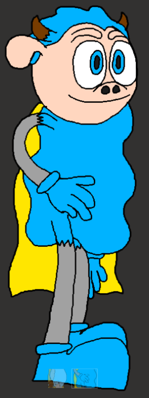
I made this design after they revealed what the newer re-designed Sonic would look like via the very next trailer:

For my second design, I decided to hold back on the realism a little bit to bring it much closer to the original Super Sheep while still keeping some of the intentional inaccuracies, I.E: I made Super Sheep's eyes bigger and less goat like in appearance while also keeping them separate and making them blue instead of black, I made his horns smaller, I replaced the puma shoes with generic blue shoes and I also gave him blue gloves for good measure.
What I didn't expect to find however was that when I showed some of my friends the two designs back to back, a lot of them said they found the first one to be less creepy, which I didn't expect since I intentionally tried to make the second one more appealing by comparison, although saying this, I think the reason for this might be because both drawings were done in 2D rather than 3D, plus the eyebrows on the second one may have hampered it's ability to look more appealing.
Now that I've established that, it's time to finally begin the storyboarding process.


I've decided that I want to base the teaser spot on the scene where a new character I made named Clint E. Orson (who's the C.E.O of a new location I'm currently calling "Rip Stickler Studios") as well as my veteran villain Hex Moother are making the Holi-clones of Super Sheep and friends since I think doing this will allow me to set up a little bit of mystery as to what's happening, thus building hype and speculation for what might the Hollywood version of Super Sheep is going to look like:


In my case, Clint is supposed to be pouring a sample of Super Sheep's DNA into his "Star Creation Machine", the reason this even exists is because in the lore I'm setting up for Super Sheep and friends (and to a lesser extent, most of my other intellectual properties), humans have managed to make so much technical progress that you'd think it was the future, the animals meanwhile haven't quite managed to progress as much due to living in poverty and in the cases of certain species, they get killed for human consumption. (which is why Super Sheep lives in a dingy apartment)


The reason I say this is "new-ish" is because this is actually an evolution of a previous trick I did where I would write down the shot type the panel is supposed to be depicting as well as what was happening on screen, this way I don't have to worry about doing the shot list at all since the storyboards now serve the purposes of both itself and the shot list at the same time (meaning I could finally cut one of the more boring bits out of the equation entirely if I play my cards right)


Something I always like to do when working on a storyboard is that I usually like to have a little arrow that points towards the next shot and says what we're supposed to do in order to get to the next shot. (in this case, we're cutting to the next shot) I've been using this little trick ever since my first projects back in level 2 (although even after all this time, the jury's still out on whether I actually invented this trick or not)

some times you may need to adjust the framing of a certain aspect of the illustration, but since I don't feel like drawing out the entire hand from scratch all over again, I've decided to turn to the marquee tool for help since it allows me to pick a small part of the layer I'm working in and adjust it without affecting everything else in that same layer, thus saving time and effort that can be better spent producing the whole thing

Whenever the next panel happens to be the next line over, I usually like to have the arrow "warp" to the other side of the screen like Pac-Man does in his game, the reason is that it allows me to save on precious space while still communicating the next camera action.

Here, we can see a perfect example of a character being off model in the storyboard, as the "live action" Super Sheep looks nothing like the drawing I showed you earlier. This is mainly done as a method of speeding up production more than anything

Well you see, this box actually represents the camera's ending position, and the little arrows pointing towards it are supposed to signify that the camera is zooming in on the window of the star creation machine


Well that didn't take very long now did it. In fact, it took way less time than I anticipated it would (only about a day or two), but thanks to the power of excessive corner cutting and the fact this project is quite short to begin with, I was able to get it finished. Doing this was very easy thanks to all the experience I've gained doing storyboards over the course of my time in college.
As a direct result of how short this project is and how few batches there are this time around, there was only one batch I needed to do (so this officially holds the record for the least amount of storyboarding I've ever done), the process didn't get tedious at all.
With all that done, it's time to move onto...
The Asset List
This particular list is going to be important because it'll help me to keep track of what assets I'll need and what I've already got (that way I don't end up scrambling around trying to remember what I need or already have)

When it comes to this part, I usually like to split the asset list into multiple smaller lists for each category of assets because it allows me to keep track of everything in a much easier form than the traditional asset list

This only took a couple of minutes for me to do, the only things I really had to ad were the "props" and "effects" categories because I forgot to during the first screenshot but other than that, there wasn't any hassle to be had.
With this in mind, I now need to make a proper design for the star creation machine before I dive right in, although if I do that too quickly at college, I'll be stuck since I can't then go into Dreams PS4/5 and make everything right away since I can't really bring my PlayStation 5 into college and then start playing since not only would I need to inexplicably find an empty power outlet and a TV to plug the whole thing into, but I'd also need to actually connect the PlayStation to the college internet for assets where I need to use certain pieces (I.E: the characters hands which, if I haven't said this already, I usually take the hands from elsewhere), so I'll be stuck with next to nothing to do after that point until Wednesday (since that's one of my days off from College)
Designing the Star Making Machine
Ok, so as it turns out, I ended up falling sick today, so I didn't quite get to do the design process in college like I wanted to, and since my brother currently works at the same desk that I do, I couldn't really do anything at home either, but now that his working day is over, I can finally get started designing hte star making machine:

During the storyboarding process, you may have noticed that Pixlr's interface has had a few additions made recently, namely the new "Animation" tab that's situated between the "Filter" and "View" panels. I had a quick check to see if this meant Pixlr had finally added in the means to make animated cartoons but alas, this was not the case because as it turns out, this new animation feature only allows you to apply animated effects to your images and nothing more, so this update probably won't change much for me in the long run other than the placement. (oh well, back to the machine)

For this machine, I've decided to use the square tool in order to quickly block out the shape of the machine itself without having to constantly draw the same thing over and over and over again since I'm currently doing this job after hours (and I really want to get this done before eight since that's when I usually like to stop and relax)

the reason I'm switch to the drawing tool is because a lot of the time, the more minute details require that I do a little bit of free hand drawing (plus it means I can add in a little bit more character to the design later on)

While I could use the wobbly line tool (or as Pixlr seems to call it, the "Bezier") to do this process like other professional artists do, I find it much easier to just use the drawing tool to draw out these curvier objects manually because that's what I've been doing for the past forever.

you see, if you were to create a line from one end of the slot to another and then rotate the placement of your line before placing it down, you can actually get a very believable lid that would actually cover the entire top once closed (so there's a potential tip for other fellow artists out there)

In order to give a scale of reference as to how big the machine should be relative to the average human character in the Slamination Studios universe I'm making as well as show off what the machine was designed to create, I've decided to add a generic human character into the main chamber where the clones are created.

The reason I wanted to do this instead of just using the text tool to get the text in there is because I wanted to rub in the fact that this machine is the "property of Rip Stickler Studios", plus adding in text also allows me to make the implication that this movie studio is actually owned by Hex Moother

Basically what happened was that while I was making the design, the computer I was using inexplicably turned itself off and on again as if there was some sort of power cut. While this was a slightly frightening experience, I was able to use Chrome's restore feature in combination with Pixlr's temporary cache files to get my design back. So with that out of the way, what do I mean by "clean up?"
Well you see, in the context of art and 2D animation, the term "clean up" simply refers to erasing any unneeded lines from the final art piece in order to make it look like certain parts of an object and/or character look like they're naturally passing in front of each other (so in other words, it means erasing lines that no longer need to exist)

Cleaning this particular drawing up was quite easy seeing how there weren't as many lines to rub out when compared to other art I've done for characters such as Super Sheep and friends.
When it comes to adding colour, I usually like to use the fill tool because it helps me save time that would have other wise been spent colouring everything in by hand.

When colouring the machine itself, I wanted the pipe colours to represent the three main colours that are associated with the three main characters (Blue for Super Sheep, Brown for Hugo and Pink for The Night Pig) since this machine is intended to be the means by which Holi-Sheep and friends come into existence. I also decided to give the machine a slight green tint so that it could stick out more from other, but before I finish up for the night, there's just one more thing I've got to do first:

The reason this step is so important (especially for inanimate objects that don't already exist in the real world) is that it let's others know what purpose each design feature is supposed to serve without having to be detectives on the level of Sherlock Holmes


Designing this machine wasn't very difficult because I had the sketch I did during the storyboarding process to go off of, the only real snag I ran into was that my computer crashed in the middle of making the image because at that point, I thought I would have to start over again because I hadn't saved the picture, but thanks to Chrome's restore feature and the fact that Pixlr had saved my progress into a temporary cache file, I was able to keep going like nothing happened. I quite enjoyed getting to draw out the design for this machine, as it allowed me to start drawing things properly again. (plus it doubles as progress on my personal project, so tonight I was able to start the process of killing two birds with one stone) Tomorrow, I'll finally be able to get started on the asset production and gathering phase for this project, meaning it's back to streaming things for little old me.
Asset Production And Gathering Day 1: A Big Machine, An Arm, A Terrifying Version Of Super Sheep
I found today to be quite productive, as I was able to make The Star Creation Machine, Holi-Sheep, The DNA vial, Clint E Orson's arm, the Rip Stickler Studios Star Creation Facility and I even found the sound effects for thunder via a prize I found while playing through the story mode. (Art's Dream)
Before I say anything about what I did today, I just want to mention why Dreams' dream shaping interface suddenly looks different. You see, Dreams had a bit of an update as part of the release for Media Molecule's latest Dreams campaign "Ancient Dangers: A Bat's Tale", where they ended up adding things like templates for game genres such as 2D platformers, 2D space shooters, the "Ancient Dangers" game and even mini golf, as such, they overhauled the dream shaping interface to accommodate the addition of the new templates. Now that that brief explanation is out of the way, it's time to discuss what I did today.
The first thing I made was the Star Creation machine. In order to make sure that the main chamber could actually hold a human sized character, I decided to bring in Captain Cartridge so that I could use his model as a scale of reference so that I could also fit Holi-Sheep in there by proxy since Holi-Sheep is going to be around the same size as the regular Super Sheep. (who himself is smaller than your average human) The main boxes were easy to make since the whole thing consists of just two cuboids and three cylinders mashed together along with an antenna with one of the sides being separated from the rest so that it can serve as the door. The surprisingly difficult aspect however ended up being the glass I needed to paint for the window itself, as the first method I tried involved using a black sphere in order to give the glass a more rounded shape ended up taking too long to do manually and it didn't end up looking good after I'd copied and pasted a bunch of the paint strokes, so I decided to make it a flat window instead, thus simplifying the whole thing. (since now it looked much better once the copying and pasting started)
The pipes meanwhile weren't too difficult to make since I was able to use the curve tool in order to make the shapes specifically connect from one part of the machine to the other. The note worthy thing I did however was that I decided to make the pipes white by default, I did this in order to allow myself to change the colours of each individual pipe depending on what coloured DNA sample is being poured into it. This is mostly for if I ever decide to bring back Rip Stickler Studios after finishing up work on Super Sheep in Holly-weird Hijinks. (the actual cartoon, not this 20 second teaser trailer)
The next Asset I made was Holi-Sheep because I figured it would be better to work on him first before doing Clint's arm (which I just ended up taking my Captain Cartridge model and copying just his arm in order to get the job done fast) since his existence is the entire point of both the cartoon and the teaser.
What I did for Holi-Sheep was simply take the Super Sheep model I already made, copied it so that I would always have the original model as a reference point and then simply replaced Super Sheep's head with a more "realistic" sheep head as well as a pair of hands made by a dreamer named "TheRedProphett" (the very same pair of hands I've been using on my human characters), although this model took me a couple of attempts to re-do since the first time it wasn't quite aligned to the centre of the scene. I also decided to de-saturate all the blue areas of Super Sheep in order to further enhance that "realistic" look I'm going for with this character and I even decided to buff up his arms and legs by modifying the sculpts that made up said legs and arms and I've got to say, this super sheep is definitely looking a lot creepier in 3D than he ever did in 2D:

The horns and ears weren't too difficult thanks to the power of the curve tool, but I'm thinking I could touch this model up a little bit more because as of right now, he looks like a Little Big Planet character gone horribly wrong with his huge head. (perhaps I could shrink it down to make it more proportional with the rest of his body)
Next, I went to find a lightning sound effect to put into the collection of assets I've been making and doing so ended up being much more difficult than I'd anticipated due to the fact that the lightning effect I was trying to find was in the "prizes" category, (which is where a lot of the assets for Art's Dream can be found once collected) as such I had to go out and find another Dreams collection that happened to contain the very same perform-able thunder instrument and eventually I ended up finding it and getting it into my collection. (and then after the stream when I checked the asset list, I ended up realising that I'd actually put "electrical current" sounds and not lightning after all)
The next asset I did was also the easiest asset, as Clint's arm was simply just the severed arm of one of my Captain Cartridge models. I figured since most of the screen would be covered in darkness I could get away with making Clint's model just a singular arm. The only real note worthy thing that happened was that I decided to switch from stealing the arm from the regular Captain Cartridge to stealing the arm from the Slam Jammers model so that I would have an easier time making his shirt more of a short sleeve one than a long sleeve one (since he's going to be working with the DNA vial)
Afterwards I got to work making the DNA vial, which I did by first creating a cylinder with a sphere stuck to the bottom and then used the paint tools in order to paint the main vial over the 3D shape via the surface snap guide in order to make the shape more accurate. (plus with paint strokes I can make them transparent and glass like in the same way I did with the glass area of the Star Creation Machine since that was also made with paint strokes) At first I got rid of the original 3D reference once I was done with the painting process, but then later I decided "hey wait a minute, I could totally use the 3D model as the liquid DNA sample", so after undoing a lot of what I did in order to get the 3D reference back I was able to make the 3D model white so that much like with the pipes on the Star Creation Machine, I could make it any colour I choose. (again, mostly for future proofing purposes if I ever wanted to use it again in the future)
After I finished work on that, I then got to work on Rip Stickler Studios' Star Creation Facility itself, or at least this minimalistic version of the Star Creation Facility since it's being used for a teaser trailer and not the finalised cartoon. For this location, since I wanted mostly everything to be in the shadows for the sake of keeping Holi-Sheep a bit of a mystery as well as hiding the fact I haven't actually made a design for Clint yet, so I was able to more or less get away with making it a relatively small empty warehouse with only a couple of lights to make the machine, Clint's arm (as well as the vial), and Holi-Sheep's shoes barely visible in order to create a sense of mystery around what Holi-Sheep looks like (even though these streams sort of kill the mystery entirely)
Overall, I quite enjoyed making the assets and can't wait to (hopefully) finish up the asset production and gathering phase by next week so that I can get started on the animation process once the half term break kicks in.
We Interrupt This Program To Bring You Another Project Management Update

So this week is when I'm supposed to start making the assets, but since I've already started last week, I can just keep going from there... Or at least I would if I were still at home, since that's where my PlayStation and my copy of Dreams PS4/5 are at the moment, and it's not like I can bring a PlayStation into college since that would also require a TV and multiple empty plug sockets for me to plug all the equipment into. The only asset I can really do as of now is the light switch sound effect, but after that point I'll just have to figure out what to do next
Asset Production And Gathering Day 2: Light Switch Sounds
For this asset, I've decided to produce my own foley sounds since light switches are very easy to come by in my house and at college, so after finding an empty room to go and flick the switch in, I was able to use my phone in order to record myself turning the lights off and on again multiple times in order to get multiple variants of the same sound to choose from (yes I know the video is vertical but the point of this session is to record the sounds rather than the visuals):
Now all I need to do is record the whole thing in audacity in order to get just the audio and I'll be good to go on...

So while these college laptops do have audacity installed on them, from what I found while digging around trying to find the "Stereo Mix" option, I can't seem to find it anywhere so I may need to switch to a computer that has Audacity as well as the "Stereo Mix" option (since that option allows me to actually record from the computer directly (although if any notifications popped up, those would get recorded, thus meaning I'd need to start over again.
I talked with the technical support tutor about my plight and we tried to just import the video directly into Audacity via the "import" feature but it didn't end up working due to "MPEG issues", so now I've got to try using a video to audio converter on the internet to get the sounds:


I finally have the sound effects ready to roll, now all I need to do is import them into Dreams PS4/5 and then I'll be one step closer to being able to start the animation process.
This process ended up taking way longer than I anticipated it would due to the fact that the college's copies of audacity (or at least the one on the laptop I was using) don't seem to have the "Stereo Mix" option installed (as far as I was aware when I tried to find it), so with that I ended up having to take the long way around by using Zamzar instead (at least there weren't any sketchy Ads like on the OTHER video converter I used to turn to for this sort of thing), and that's not even mentioning the relative difficulty I had getting the video itself off my phone since sending it to my tutor via teams didn't work because when I tired to snd the video through it would say "failed to upload image" (despite the fact I was trying to send a video file over), and sending it to myself via email didn't work because the video file exceeded the 30MB limit for files being sent via E-mail. Luckily, I was able to upload the file directly to OneDrive through my phone, so doing that might be the new go to method for sending files to myself, particularly if said files happen to originate from my phone since that's where the issue originally lied in the first place.
Now that that's been taken care of however, I'm in a bit of a predicament, as now I can't really continue making assets or even do the animation process until I get back home since again, that's where my PlayStation and my copy of Dreams PS4/5 are, and since the college still haven't got any PlayStations in (even after I've been in this exact same predicament during the production of both the Escape From The City music video and The Grand Lamppost Heist), so it looks like I may have to work from home to get the rest done
Oh Wait, Never Mind I Just Had A Bright Idea
So I was looking at the asset list in order to see if there was anything I could feasibly do before I have to start asking to work from home and ended up thinking to myself "you know, perhaps instead of finding a pouring sound effect in the game, perhaps I could simply record my own instead", and that's when I got the bright idea to go ahead and do that instead:
For this one, I used a bottle of water I had in my bag and a cup I borrowed from the technician at the time and simply held my phone relatively close to the water (but not too close because as we all know, electrical equipment and water do not mix well what-so-ever) and I was pretty much done with the recording session. Much like with the visuals, it's generally a good idea to do multiple takes of the same sound effect so that when the editing phase kicks in, you'll have multiple choices as to which take you think would sound best (that's why I switched the lights on and off multiple times), but for this one I was willing to make an exception because I thought the first take sounded quite good and I didn't want to take multiple trips in order to fill the water and then pour it again.

Getting this sound effect was a lot less painful than than the light switch sound effect because now I was able to skip straight to the parts that actually worked and cut out all the hassle.
You know, recording these sound effects myself instead of finding them on the internet and/or Dreams PS4/5 has actually turned out to be quite fun because now I'm able to learn more about how sound effects are made first hand rather than just stealing a whole bunch from the internet, other media and/or the Dreamiverse and calling it a day like I would before. With this in mind, I'd actually like to do this sort of thing more often.
Asset Production And Gathering Day 2: Sound Effect Pains And A Nice Light Switch
wow, it's already been an entire week since I last streamed myself producing assets, that usually never happens because under normal circumstances I'm spending a lot of my time off actually getting this kind of thing done, but a spanner was thrown in the works when my brother's girlfriend came around last Friday and ended up staying the weekend, so I was unable to continue producing the rest of the assets at that time due to a need to entertain the guest, but then over the last two days, while I was at least able to produce all the sound effects, I then had to wait a little bit more until today where I could import all the sounds into Dreams and start producing the model for the light switch. (which is why I decided to look into that Matrix demo Epic Games did to show off their new Unreal Engine 5) With all that said, how did today end up going?
Well today, I decided to start off by producing the model for the light switch since I figured that would be the more difficult thing to work on, but much to my surprise, it actually ended up being the easiest thing to make today (since it only ended up consisting of a cuboid and a couple of separate pieces that go up and down. For this asset, I decided to take a slightly different approach than what I would normally do, as I actually decided to make the back end into a similar light switch but with two switches at the same time instead of just one. This was mainly done so that I could future proof the asset for later use, like if I ever ended up needing a double light switch at some point I could simply use the same asset, thus allowing me to not only save on memory, but also the unique element limit, that being 256 for those of you who are curious. (Media Molecule have actually used this trick during some of their streams)
Rigging the switches to actually move wasn't too much of a hassle since this was a much simpler model than Randimeer B. Process from the Captain Cartridge remake, it was just a matter of making sure everything was centred and that the light switches actually adhered to their real movements as best as I could and then afterwards bringing in Billy Billson's model as a scale of reference. Other than that, it was a real breeze to make the light switch model.
As for the process of importing the sound effects, that ended up being a much more difficult situation than I'd anticipated, as when I first went to import the sound effects, I ended up running into an issue where the sound would come out as a horrible static noise instead (meaning I probably should have put a noise warning in the title of the stream itself), I have actually encountered this issue multiple times before and had assumed it was always random when it would happen (either that or I just plugged in my male to male headphone cable improperly), but as I would come to discover when trying to remedy the problem off stream, I ended up discovering the source of my problems. Turns out the reason I'd been getting static this entire time was because I was trying to import the audio while my phone was on charge, so I imported version one of the two sound effects off stream and after being unsatisfied with the results due to the appearance of this persistent buzzing noise in the background which seems to happen randomly, as sometimes the buzzing noise isn't there at all (as well as discovering that the headphone volume hadn't been maxed out since last time I messed with it I actually needed to wear my now broken pair of gamer headphones), but when I went to re-record the sound of the light switch in particular, I ran into another issue where the sound wouldn't even register as being recorded because of how quickly and quietly the sound went by, so I had to steal a sample from the internet in order to even get it to register (so during the stream you may have randomly heard Peter Puppy from Earthworm Jim drone on about realising he's consuming the heart, lungs and liver of a sheep boiled in it's own stomach yet again)
Despite my best efforts however, I couldn't get rid of that persistent buzzing, so unfortunately I'll just have to make due with what I've got for the time being, but hey, at least I'm almost done with all the assets, just the music and the lightning effects and I'll be good to go, although I'll probably just do them both during the main animation process to make things easier for myself.
Speaking of the animation process, I think this one will be quite short since the whole thing is only meant to last 20 seconds anyway and I'm putting everything into one scene, plus there won't even be that much movement involved with this (just an arm pouring liquids, a door opening and a creepy looking sheep opening his eyes and that's about it, so clean up's hopefully going to get a lot of extra time if I play my cards right)
But What Are The Pros And Cons Of Composing The Music While I'm Animating?
Well the main pro of composing the music while I'm animating is that I can go ahead and make my music better suit what's happening on screen instead of having to imagine how it will sound once I insert the pre-composed music and then having to change certain parts within the scene, although admittedly this isn't very difficult to do since when I do find myself having to do this I can just edit the timeline right there in the scene itself (it's more of an inconvenience really), but composing it as I go along will certainly mitigate all this in the long run since I can make sure the music and the visuals complement each other in a more specific way than I would otherwise.
Another pro to doing this is that I can more easily experiment with giving the music a completely different sound since when you replace instruments that already have notes in them in Dreams, it actually keeps all the notes you put in, thus allowing you to essentially switch musical genres like you would with a camera lens or even TV channels. Of course, depending on how the new instruments sound or even whether the instruments themselves are considered "Drum Kits", you may have to edit the notes to make it better fit that sound but other than that, it's very easy to pull off. (To replace instruments and even sound effects in Dreams PS4/5, all you have to do is drag one instrument over the top of another)
The main con with doing this however is that the process of actually composing the music will then become a more labour intensive process since now I'll be taking a lot more time tweaking the music track to make sure it fits perfectly with what's happening on screen, which does have the potential to take a lot of time that could be better spent doing the animation for the video itself.
Despite this fairly big con however, I still think it'll be worth me doing this because of the freedom I'll get to play around and experiment with the music's sound as I go along rather than being restricted to one sound that I might end up being unhappy with, although even then I can still go ahead and change the instruments at least.
We Interrupt This Program To Bring You Another Project Management Update

This week, I'll be starting the animation process for this advert at long last, and since I'm starting this one on time, I'm technically still on track to finish on time.
We Now Return You To Your Regularly Scheduled Program, Which Is Currently Being Animated
Ok, so the animation process is finally underway for this project, and right now things are going quite smoothly for me at the moment, as I'd only done about a half hour's work and already I'm a good chunk of the way through.
The first thing I did today was actually get all the props that weren't already in the scene (all one of the main ones) and then decided to change the main material properties of the Star Creation Machine because I didn't like that the colour of the machine itself wasn't really coming through with the big lights shining on it. (probably because I made it too shiny to begin with)
Afterwards, I decided to go ahead and lay out all the camera placements while using the storyboards as a reference (since this time I actually remembered to put them on my phone before I started) in order to get more of an idea as to how everything would play out in the final product (well, except the part where the camera pans up, as I want to animate that part after I've animated the door opening to make things easier on myself in the long term) and I've got to say, I'm quite liking the way things are playing out at the moment, although to be fair, the fact I was actually able to manipulate the timeline itself certainly helped in this regard. (since I was able to make it exactly 20 seconds long at 100 percent speed)
Once that was finished, I got to work animating the part where "Clint" pours the DNA vial's contents into one of the holes in the machine, this part was actually very easy, as all I had to worry about was animating a single arm rather than an entire character model, meaning I could move the arm in more ways than just rotating the whole thing since there wasn't a body there to stop me from doing this, and as long as the black on his suit blends in with the natural darkness of the scene, the audience will be none the wiser. (it's a trick similar to how 2D animators handle this sort of thing, as they would be able to do this same trick, only much more effectively since they can draw more or less of each character depending on whether they're receding into or coming out of the darkness) The only thing I really needed to do afterwards was add a 3D model for the contents being poured out, which I was able to make right there and then thanks to the sculpt tools. To me, this showcases one of the good points of using Dreams over more traditional software such as Blender or Maya, because in Dreams, you actually have access to every tool no matter what you're making (whether it be a song, a model or even an entire game level/animation), thus allowing you to make various last minute additions such as that pouring model and the lightning, which will come up later. In something like Blender for example, making models on the fly like this isn't as easy due to the comparative complexity of modelling in general
After that was finished, I then animated "Clint" flicking the light switch. Doing this was very easy, since all I had to do was pivot the arm and then flick the switch. (simple stuff really, since most of the arm isn't even on screen)
The part that came next was adding in the lightning. Adding this element here was quite easy, as I wasn't even working with making 3D models, instead I decided to use paintings in order to portray the lightning effects, since doing this would be much easier in terms of switching between frames quickly. For those of you that don't know, paintings in Dreams PS4/5 are actually quite versatile for doing quick 2D animation, as they can actually contain a maximum of 100 frames each, meaning I can actually make the lighting an animated effect. (also, much like the models, they can also be made to glow, whether or not that glow emits light is up to you) As such, I created 3 frames for it on order to create the effect that the lightning is flickering. Figuring out how to tie this to the lightning instrument activating is proving to be quite a challenge at the moment, but I'll be able to figure that part out tomorrow.
After I did this, I just slotted the sound effects in there. This was the easiest thing for me to do since a lot of the parts where they would be needed were already more or less finished, all that was left to do was to slot the sounds into the right places. (much like the last few puzzle pieces in any given puzzle)
In between all this, I was also working on Holi-Sheep's movements while he was in the machine, which I did by first cloning the original model and making it invisible since it's currently not needed. Afterwards, I had to decide whether or not to just make the new clone all black in order to cheat the lighting, and after finding that the bright lights created by the lightning gave the game away as to what Holi-Sheep actually looked like, I decided to just do it and then animate him getting shocked. Making this animation was very easy, as it only ended up consisting of 4 frames that quickly transition between each other before looping back around.
The reason I didn't get more done during the day was actually because as I was finishing talking to some friends of mine, the stream ended up cutting out abruptly due to server connection issues (which usually never happens when I'm streaming anymore), so hopefully tomorrow will prove to be a more productive day.
Animating The Video Day 2: Giving More Life To Everything
Yesterday (the reason I say this instead of "Today" is because I never got the chance to say this yesterday due to going off to see "Scouse Sleeping Beauty" after I'd done the stream) turned out to be quite productive, as I managed to do more work than I did yesterday, although the bulk of that work mostly boiled down to animating a door opening and adding a few more sound effects. (some of which wasn't originally on the asset list because I didn't think to put in a collision sound originally. This sort of thing always seems to happen on these types of productions)
This is where having two separate clones of Holi-Sheep ended up coming in handy, as I was able to use a keyframe to switch out the two models without it being immediately obvious since it happens as the camera cuts to the door, meaning now the Holi-Sheep that's getting shocked becomes invisible while the one by the door becomes visible right as the door begins opening, thus meaning those in the audience that aren't super savvy about this sort of stuff are more likely to believe that only one model was used.
Speaking of the door, animating that was as simple as using two keyframes in order to rotate the door so that it hits the ground. I also decided to add in a camera shaker gadget so that the camera would shake once the door hit the floor for the sake of exaggerating its impact for dramatic purposes. Of course, once the door was animated I was then able to more easily animate the camera moving up towards Holi-Sheep's face since I could actually see the model. If I were to do this before animating the door opening, I'd have to do a little bit of estimating based on where Holi-Sheep's nose is since that actually happens to pass through the door when it's closed (but luckily, due to the position of the camera, no one will ever know unless I point it out so I decided to let it slide)
As for the copy of Holi-Sheep that stands at the door, I decided that I didn't want it to appear lifeless, so I figured I should at least animate some sort of standing cycle for him. Unlike other previous cycles however, I've actually decided to go ahead and add more of an "ease in" and "ease out" in order to see if I could add a little bit more weight to the animation (because if I'm not having to animate much this time, I figured I should at least try and make it move better to make up for it), as for how I got his eyes to open up, it was as easy as using a key frame to switch a couple of other keyframes on and off. (much like what I do whenever the characters need to switch from being angry to sad for example)
Afterwards, I actually decided to change the fonts of the text since I felt the "Super Sheep In" line could do with a little bit more pazazz, so for that one I went with the same font I used for the "Super Sheep In" line of Super Sheep in Convention F-3 cartoon.
As for the "Holly-Weird Hyjinks" and the "Coming 2022" lines, I felt like maybe I'd gone a bit too far with the horror aspect while not really leaning into the "Hollywood" aspect, so after trying several different fonts, I ended up landing on one that I think looks pretty slick and was also reminiscent of the classic "Hollywood" sign, albeit not the exact same. (maybe I could also replace the orange colour with white to make it more like the Hollywood sign or I could make purple or green in order to regain at least some of the horror aspects without going too overboard)
Afterwards I decided to go mess around for a bit by chaning the material properties of the light switch to make it more shiny as well as trying to figure out how to give "Clint's" shadow more of a body so that the arm's shadow doesn't break the whole illusion. (so far I've had no luck without the body's shadow getting in the way of the framing)
The next major task for me at this point is to compose the soundtrack to go with the visuals, but I want to take tomorrow off since I want to go watch "Spider-Man: No Way Home" due to hearing amazing things about it from friends and family that have already seen it. (I'll also be taking Christmas Day off as well, because it's Christmas)
We Interrupt This Program To Bring You Yet Another Project Management Update

I'd say it's a good thing I gave myself that second week to do the animation as a safety cushion, since that break I ended up taking would go into that second week. Luckily I only have to compose the music and then I can start asking for feedback
Animating The Video Day 3 (And Knuckles): Composing The Soundtrack And Even "Editing" The Video
Before we begin, I just want to say I saw Spider-Man: No Way Home and honestly, while I enjoyed seeing the old versions of characters like Doctor Octopus again, I still think Spider-Man: Into The Spider-Verse is the better movie because of the faster pace, the distinct visuals and Spider-Ham. (who is the best character in that movie)
Today, I got to work on finally composing that soundtrack, which I did in the same scene as the main animation because I wanted to see if that was an approach I could take going forward. (much like how professionals usually work on the sound side of things once the visuals are nearing completion since it's easier for them to do it that way rather than the other way around) I decided to go with an orchestral sound because I felt it would be a lot more fitting of the situation at hand than if I were to go with a SEGA Mega Drive/Genesis Sound like I do for any cartoon that features Captain Cartridge and his fellow "C-GULL" employees. Composing the music itself was actually quite easy (more so than I was expecting it to be if I'm being honest), since at anytime I could just rewind time, hit play and then listen to the music in order to see if it was syncing up to what was happening on screen, and if something wasn't going as planned, I could just switch back into edit mode and edit the track accordingly until it sounded good playing alongside everything else. Overall I'd say I quite like this method of handling the score, since it means I'd no longer have to imagine how the score would play with the rest of the scene, as now it can be tailor made to cooperate with the visuals perfectly, meaning no more having to manipulate the music after the fact during the animation process.
Afterwards, I decided to tweak the logo so that the "Holly-Weird Hyjinks" and "Coming 2022" lines so that they were purple and green instead of just being orange and I've got to say I really like the way the colours contrast with the dark background while also communicating the light horror aspects I want to incorporate into the main short via the creepy designs of the justice trio's main opponents (those being the Hollywood movie redesigns of themselves)
After I finished that and took a quick break to play Nickelodeon All-Star Brawl, I moved on to the "editing" phase, which was really just me going ahead and cutting down a recording I made of the animation (because at my house I don't have access to premier pro like I do at college), so there's no real noteworthy challenges there. All that's left to do is to get feedback and then use it as part of the clean up phase, release the video, do my evaluation on it and then I'll be finished with this project
We Interrupt This Program To Bring You Another Project Management Update

Ok, so things have slowed down significantly since my last update to the post (specifically during the new year), meaning I haven't had any time to do the clean up phase like I wanted to. This is entirely on me because during the Christmas holidays I actually managed to get a gaming PC (part of me didn't think this would happen but my parents pulled through), meaning I've been too busy playing games like Half Life 2, Portal 2 and at long last, Sonic Adventure 2 (been waiting many years to finally play that one):

Overall, I've been having a blast with my new gaming PC, but I'm getting off topic.
Since I'm only in college one day this week, I think there's still a chance for me to make up the lost time implementing the feedback I get over the weekend before finally releasing the finished project, so without further ado, it's time to gather and implement some feedback on my project.
We Now Return You To Your Regularly Scheduled Program, Currently Gathering Feedback
Ok, so today's the first day back in college, so I've been using today in order to gather feedback from others about what they thought about the advert and what they said needs improving. (with my own thoughts on what needs improving mixed in too because one can never have too many things to improve upon when it comes to improving their own works)
So far everyone I've shown it to has really liked what I've done, so I seem to have done a good job appealing to the audience I've been aiming for:

With that in mind, some of the people I've shown it to have put forward some great ideas as to how I could improve upon the whole thing, from adjusting the lighting on certain bits, I.E: adding a backlight to The ending shot in order to make Holi-Sheep's silhouette more defined, which come to think of it, would actually make my TV spot more like the infamous teaser poster for the first live action Sonic The Hedgehog Movie (and since the entire concept of Holi-Sheep in general is inspired by the first Sonic movie's initial design, it all ends up working out well in the end):

With this particular piece of feedback in mind, I'll need to find a way to do this without giving the game away for those that don't read these blog posts. (maybe by adding a subtle backlight to the final shot, which may even make the "Star Creation Machine" a little bit more intimidating if I play my cards right)
Another piece of feedback I ended up getting related to the approach I took when it comes to animating the water pouring into the Star Creation Machine, as they mentioned how it looked like the DNA was all coming out at once. This ended up getting me to think about ways I could make the DNA pouring effects look better and the main Idea I ended up landing on was that instead of making the pouring model appear out of nowhere, I could instead have it grow as the contents spill out, thus making it not seem as sudden (come to think of it, I probably could have done this for the tornado back in my first final major project: Super Sheep in Convention F-3, but at the same time, doing so would remove a little bit of the absurdity of the situation)
One of my tutors actually suggested I could add in credits in order to let people know that I made this spot, but if I were to put the credits before or after the entire thing it would add a little bit of additional run time, but an idea I came up with just now is that I could slot them in just after the title card via text replacement (since that's what they do during some TV Spots anyway)
Of course, I also wanted to throw my hat into the ring too when it comes to potential improvements since I usually like to be my own worst critic, so after scouring the video numerous times over the course of the day I ended up noting a few things I felt needed improving. (since the grand majority of the feedback I got was mainly praise)
One big area ended up being with things like the way the pipes seemed to look out of place when next to the machine due to the material properties I'd set for them earlier in the asset production phase, since I feel that this could come off as distracting to the wider audience that might come across this advert randomly while scrolling through YouTube due to the radically different shading on both objects and even the fact that the lightning effects were made way too bright in hindsight (I know that lightning and electricity is supposed to be bright, but I feel that the amount of light given off could a bit too distracting and since this is animation we're talking about, I can simply lower the brightness down a peg to fix this)
Feedback Implementation Day 1 (Retroactive Edition)
The reason the title mentions that this is the "retroactive edition" is because I actually did a lot of this yesterday after I got home from College after I finished going on about the feedback I gathered, so we'll be looking at this one after the fact. (meaning I'll be referring to it more in the past tense than I usually would)
Yesterday, when I got home I was able to get started actually implementing the feedback I got for this project and one of the first things I did was add in the back light to the final shot in order to better define Holi-Sheep's silhouette. I figured adding it right into the group that contains the model used in the second shot would save me from having to use extra keyframes in order to turn the back light on at the exact same time plus it also means when I'm editing the light (which would later become multiple lights because I wanted to create even more of an outline than I had with just the one) there's no chance that I'll accidentally move the machine instead, although in fairness, I could have also achieved the same result using the "freeze" tool in order to prevent any edits from being made in general. (including deleting it) At first, I considered tinting the light blue, but then I switched to red in order to contrast with Holi-Sheep's blue colour palette (and by extension, it would also contrast with Super Sheep's colours too since they both share the same blue colour scheme) before ultimately deciding that the blue light would better fit the character anyway and just going back to that.
Afterwards I decided to go ahead and turn the brightness of the animated lightning effects so that they looked less distracting while also keeping in mind the fact that lightning is supposed to be bright, I think this change makes the lightning effects look way better than they did before because now they work to make the scene brighter without it looking super distracting.
While I was there I figured I may as well also add in that second lair of glass in order to make it look like there was actual DNA in the machine (because there was no way I was putting all that in there manually), this was quite easy to do because all I had to do was clone the first layer, tint it purple, make it less transparent and apply a flowing effect to the whole thing and I was pretty much good to go (although today I did end up needing to make a few further changes)
Once that was taken care of for the time being, I decided to go add in the credits by cloning the text displayers that contained the title and "Super Sheep and Friends in" and then change those clones so that they would become the credits sequence, from there it was just a matter of setting up a key frame to change between the two sets and boom, instant credits sequence (and the best part is that I didn't need to add in any extra run time or ruin the framing like I would have done with the other two options I had at my disposal), this was very easy to pull off thanks to the clone tool and the key frame only needing to switch one or two text displayers off while switching another pair on at the same time.
What ended up taking up most of the stream (and thus ended up being the most comparatively difficult thing to make) was actually the big computer, not because of the sculpting or even the addition of little blinking lights (which I did via paintings), but actually doing the painting that cycles between a picture of the real Super Sheep's head and the word "KILL", but even then it was only because drawing the picture of Super Sheep's head took so much time and not due to any actual difficulty (since I did have the surface snap and studio lighting guides to help me out)
Feedback Implementation Day 2: The Stuff I Actually Did Today
Now that we've had a re-cap of what I did yesterday, it's time to dig into what I actually did earlier today.
So today was mainly about making a few minor alterations to some of the work I already did (you know, stuff like adding an additional credit to Dreams PS4/5, adjusting the backlights so that the outline was more easily defined, that sort of thing), but the most noteworthy change I ended up making was actually a direct result of messing around with the sun and sky gadget and liking the results it had on my artificial lighting. (sometimes, goofing around can actually result in a better looking project) What ended up happening was that after I put the natural lighting the way it was, I decided to use the grade and effects tool to add a subtle orange colouration to the entire scene so that I could tint the light pointing at the light switch with that similarly orange colour and even make the scene itself feel more like it's taking place really early in the morning or even late in the evening rather than broad daylight. As a result, I did end up having to make further changes to the light pointed at the light switch so that you couldn't see the arm's full shadow (which would have totally ruined the illusion that this doesn't feature some big sentient floating arm), but after doing all this, I actually think I like this version of the video better than the first version due to how it feels more distinctly eerie.
Feedback Implementation Day 3 (And Knuckles): Revenge Of The Reddit Edit
Today, I mostly just put the video itself together in Share Factory Studio. (well, I say "putting it together", but that really just boils down to me recording the footage I made and then cutting it down to be 20 seconds like the brief asks for) Before I did that however, I actually decided to extend the time line in the original animation 5 seconds to the left meaning there's an additional -5 seconds before any movement actually starts (or would that be a sub-tractional -5 seconds since we're working with negative numbers here), which is why there's a 5 second countdown in the recording I made earlier. You're probably wondering why I've done this instead of leaving the timeline alone. You see, the reason I did this is because whenever I go into play mode from Edit mode, there's this little transition that plays while the scene is starting and I wanted to cut it out of the equation entirely (you may have caught a glimpse of it in the first version), so I figured if I added in an extra 5 seconds of dead air, I could get rid of the transition altogether, thus fixing a minor issue I've been having for ages.
With this in mind, the "editing" phase has been a real snap, so there's not much more I can think to say here.
The Finished Video
And at long last, we have ourselves a finished video (and with less than a week to spare), I had a lot more fun producing this video than I did with the sandwich shoot because here, I was able to do something I'm a lot more passionate about and making this video has helped me get a better understanding of what goes on behind the scenes when it comes to making a teaser trailer in general, so now I can confidently say that for the cartoons I make after Super Sheep in Holly-Weird Hyjinks is completed, I'll definitely be doing something like this again. (minus the part where I take pictures of food beforehand of course)

Evaluation Time
Well, now that this project is over, it's time to look back on the project as a whole and see what went well and what could have been done better in hindsight.
What Did You Think Overall?
Overall, I at least found the video advert to be interesting to make, as it allowed me to get into the nitty-gritty of how to actually make a teaser trailer ahead of the release of a personal project I intend to release before going to university, where as the photo shoot didn't really help me out as much, although in fairness, the reason for this is because I want to get into animation rather than photography, so it's really more of a circumstantial thing than anything else. Despite this, it was at least interesting for me to look into some of the various tricks that people will use to make the food in question look more appealing than it is in reality, even if I didn't necessarily get to utilise any of them during my actual shoot.
One minor thing that I'm quite proud of is the fact that unlike a lot of my more recent work, I've actually managed to keep this one whole rather than having to split it into two parts due to having too many pictures in there thanks to the power of the "snipping tool" and how I'm no longer grabbing images that are as high resolution. (hopefully this paragraph doesn't end up jinxing the whole thing)
How Was The Research Phase?
For the research phase, I feel that I've done a fairly good job getting a good amount of detail while also making sure to cover as many different bases as I can, but in terms of statistical analysis, I feel like I could have done way more because I only ended up looking at a single set of statistics that related to how people plan to go and see "Family" films. (and even then, this study isn't even new to my research, as I'd already drawn from that exact same study when doing my final major project last year) With that being said however, this situation is a bit of a catch 22 because if I did dedicate a little bit more time to doing statistical analysis (which I personally find to be quite boring to be honest because of how dull the statistics themselves often tend to be), I probably wouldn't have been able to do everything I did here so I would have been at least a little bit unhappy with my research either way. (the next unit seems to be nothing but research, so hopefully I actually manage to get everything I want to in there) You can really tell I was in a rush to get it done because once I got to to audience theories section (particularly with the "gratification theory" section), you can see that I give the "escapism" portion detail than any other portion of that particular section.
We Interrupt This Program To Bring You Our Final Project Management Update

Ok, so now I've only got this week remaining to actually get this evaluation finished, so I can't really stay here very long.
We Now Return You To Your Regularly Scheduled Program, Currently Evaluating The Photo Shoot
Like I said earlier, I didn't find doing the sandwich shoot to be very interesting, as photography isn't really my forte to be honest, although I did enjoy at least looking into the various techniques used and even one of the practitioners of food photography in the form of Jackie Alpers and her cookbooks, although I do wish I could have done more research on that front because I missed out quite a lot in terms of the tricks and even the ability to look into at least two or three more people since if I did that, things would have been a bit closer to my usual standards, but I really wanted to move on to doing the twenty second advert since that would serve to help me in the field I want to go into in the future (that being the animation industry) and it would help me learn how I could market my own cartoons in the future.
Speaking of my cartoons, another thing I didn't really enjoy about the sandwich shoot was how I couldn't find a realistic way to incorporate my cartoon characters into the mix without breaking the rules set out on the brief, since they specifically requested photographs of sandwiches and not just any old pictures of sandwiches, meaning I likely wouldn't have been able to draw a cartoony picture of a sandwich or even create a 3D model in Dreams PS4/5 (which meant I had to work outside my usual domain, which while it is good to do that every once in a while, it can be a bit jarring)
In terms of the actual shoot itself, I feel it went alright, although I did end up having to get help from my tutor to make sure I was actually doing it correctly (as well as general technical and sandwich support) unlike the 20 second advert where I was able to do it independently due to knowing how to use Dreams PS4/5.
The 20 Second Advert
Speaking of that 20 second advert, I actually enjoyed doing that a lot because I feel it's helped me gain a firm understanding of how teaser trailers for movies are made in general, albeit in a more bite sized chunk that's more suitable for a TV spot rather than a 2 minute teaser, but it still applicable to me and my dreams regardless. (unlike the sandwich shoot)
I enjoyed looking into the various trailers and TV spots and the various tricks companies will use to entice people to want to see their film (be it animated or other wise) because the research and analysis has allowed me to gain a more firm of how I could do it myself, it also helps that I was able to pick films I'm actually interested in (I.E: Wall E and Cars 1) because then I was able to engage myself with the material more thoroughly than I would have done if I'd picked films I wasn't as interested in (I.E: most live action films in general to be honest) unlike with the sandwich shoot where I had to look into how the food stylists go ahead and make their images for the restaurants and advertisement campaigns. (which if I'm being honest, doesn't really fall in line with what I want to do in the future, but it was still an insightful experience nonetheless)
In a similar vain to that of the more generalised research phase, I wish I could have done even more than I had time to, as I would have loved to look into different styles of trailers and even how some trailers use footage that never makes it into the final film, for example, the trailers for The LEGO Batman movie heavily feature a shot where Batman and the justice league are running towards the camera despite the fact that shot never appears anywhere in the actual film as far as I can remember from the last time I've seen it (a similar thing happens with a particular joke from the first LEGO Movie where in the teaser trailer, it happens while Emmet and friends are riding in the Bat-wing, where as in the final film, it happens when our heroes are building their big ol' submarine), I also would have been able to cover the use of music in said trailers and gone on about how most trailers will typically have a piece of licensed music that headlines the whole thing and how there are exceptions like the trailer for Sonic The Hedgehog 2 (the movie, not the game) would have remixed music that originates from the source material (in the case of Sonic 2, they mix in the theme for Emerald Hill Zone from the original Sonic The Hedgehog 2 game along with the stock orchestral music), as I think covering this stuff would have further helped me understand the how and why of the way companies make their trailers and it would have been a brilliant excuse to talk about Sonic again. (because let's be honest, this trailer research served as a good excuse to talk about Wall E and Cars)
In terms of actually making the video itself, I had a fun time putting the whole thing together since I'm now well versed in the process of making videos although in this case, I ended up skipping the script and the shot list because I felt that putting it all together visually was more important (not to mention I was able to work the shot list into the storyboard, thus cutting that seperate document out of the equation entirely), I did originally consider having dialogue (those of you that are observant will have noticed the dialogue disappear part way through), but I decided to cut it out entirely due to concerns that the dialogue would make the teaser run for more than 20 seconds, which would have broke the rules stated in the brief since they stated that the advert had to be exactly 20 seconds long.
The last time I worked with time restrictions in college was actually back in Creative Media Level 2 when I made that "Stairdevil" radio drama, back then I actually ended up having to speed up the audio so that the whole thing would fit into the two minute mark, where as with this advert, I was actually able to make the whole thing exactly 20 seconds without having to change the pitch and speed of the video after the fact (at most I had to cut down a recording I deliberately made longer in order to cut it down in Share Factory Studio to begin with, but that was it), while I'd like to think it's because I've gotten better at timing things out (especially since I decided to block out the length of each shot during the storyboard) but really, it's because in Dreams I can make the timeline longer or smaller in both directions (and even slimmer or wider if I wanted to) depending on my needs (the maximum length is around 8 minutes per timeline if I remember correctly), so I was able to make the timeline exactly 20 seconds long (which really helps me make sure I don't go over or even under the 20 second time limit), another thing that really helped make the process easier was actually the fact that I was able to stick timelines within timelines, meaning I was able to give both Clint's arm and Holi-Sheep their own separate timelines (much like I've been doing with all my other characters in all my other animations ever since Captain Cartridge and friends in Operation Compact Disc, specifically from when the characters are running towards the Cartridge section of their ship and onward because the first scene was animated with everything in one timeline), thus making everything much easier to work with than if everything were done in just one timeline like in Super Sheep in Convention F-3.
One element I quite liked doing was actually drawing up and animating the 2D lightning effects, as I feel this'll serve as a great stepping stone that will help me to transition myself into working more in 2D in the future, don't get me wrong, I do like making the 3D stuff (and not to mention how far 3D animation has come a long way since the first Toy Story, especially in terms of character expressions), but my real dream is to make 2D animated films much like what Disney and other companies used to do before CGI took over the animation industry, albeit not entirely, as studios such as Aardman and Laika still make stop motion movies with relative success, not to mention the fact that despite how much I like using Dreams PS4/5 as a means of doing animation, the truth is that I can't keep using it forever because for as powerful and accessible of a tool set as it is, at the end of the day, it's still just a video game, and I'm not sure if university would be cool with some guy waltzing in and using video games to get the best grades (although I did send over an animation reel I did recently and the person I sent it tells me I've got a strong line of work):
Getting back to the topic of my 20 second advert, I think getting feedback on it was absolutely the right thing to do, as the things that other people have said has allowed me to consider things I never would have otherwise, particularly with the back-light, as the thought never originally crossed my mind (not to mention how that bit of feedback ended up being the catylist for me to start thinking about improving the lightning in general), comparing the two versions, I think the second version is significantly better than the first because the silhouette of Holi-Sheep is a lot more well defined than it was previously due to the newly added back-light, and the slight orange tint I gave the scene via the grade and effects gadget really helped capture that early morning/late evening feeling I was going for:


This just goes to show the importance of constructive criticism when it comes to media (especially the stuff I'm doing), as without the helpful feedback I got from my friends and tutors, I feel as if this video wouldn't have been as strong as it is now (if anything it wouldn't make as much sense due to how ill-defined Holi-Sheep's silhouette would have been)
I Just Received A Last Minute Piece Of Feedback

I decided to show one of my other tutors what I did in order to see what he thinks of the advert I made and he's suggested that I try and make the two highlights that exist on the DNA slots on the Star Creation Machine more closely match because the way things are currently, it ends up looking like there are two light sources rather than just one (especially with the orange tint making it seem like there's some kind of hole in the wall just off screen), this means I'll need to go ahead and do a patch in order to further improve the lighting on this video. (and with just 3 or 4 days left before the deadline, I'll have to think of a solution fast if I want to get this done and finish the evaluation before Friday) This has put my advert in the same vain as the movie "Cats" from 2019 where the special effects were still being worked on when the first cut of the film released (this mainly boiled down to the hands looking a bit inconsistent depending on the shot and even the characters feet apparently not always touching the ground), so in early 2020 they re-released the film with supposedly improved visuals:

Needless to say, this is a bit of an unusual situation for me to to be in, since I've never had to go back and tamper with any of my other work after it had already been released, but I'll try and get it fixed up further without doing a Sonic Adventure DX: Directors Cut myself, and here I was thinking I was finished. (I wonder if any other past or present students out there have gotten themselves into this situation)
Patching Things Up
Ok, this was a bit of a weird situation for me, as I never thought I would ever find myself in this situation (especially with it being so close to the deadline), yet here I was going back and touching up the project after it already released in a similar vain to what SEGA did when remastering Sonic Adventure onto the Nintendo GameCube. (the original came out on SEGA Dreamcast)
Doing this actually didn't take as long as I thought it would, as I quickly found a good solution that involved re-tinting the shadows to be black again like they were originally while keeping the orange tint on all the other areas of the lighting (those being the mid-tones and highlights) and messing with the spotlight I placed above the Star Creation Machine. I must say that taking on this patch job has turned out to be worth it for this little change alone, as now it doesn't look like there are two lights rather than just the one. With this in mind, I couldn't quite fix the highlights being in different places because as I would find out, this little quirk may have come up due to the camera angle I was using. (and I didn't feel like changing the camera's position because I didn't want to end up ruining the perceived strengths of my work)
Since doing the main bulk of the patch work was a lot faster than I thought it would be, I figured I may as well stick around and see what other minor changes could be made and at most, I just ended up adding an extra backlight to Holi-Sheep so that I could make his silhouette even more well defined, albeit without accidentally giving the game away as to what he looks like since I still want there to be a bit of suspense on that front for when I actually make the real cartoon later this year, preferably before university so that I can make it my "swan's song" when it comes to Dreams PS4/5. I'm not saying I won't use Dreams PS4/5 ever again once university comes, just that it won't be as prevalent at that point. (I'll probably still use it for things like composing my own music though)
Much like the original version, the "editing" phase mostly just boiled down to me cutting down another recording with the deliberately added count down being removed so that the video would be exactly 20 seconds long. (Nothing new there)
The Re-Released Video
Hopefully I never find myself in a situation where I have to patch one of my videos after I've already released it like this is some sort of video game, as quite frankly I find the concept of patching my own work after release to be quite strange, not to mention this has the potential to set a dangerous precedent going forward where other people might find themselves in a similar situation but without the luxury of using a video game to animate with to fall back on like I had. Now that that's all been taken care of, it's back to the evaluation.
Back To The Evaluation
Now, where was I before this bit of patch work came in... Oh yes, I was giving my thoughts on the video funnily enough.
Overall, I'm quite proud of this teaser video, as it allowed me to learn how to use the darkness in order to draw the audience's focus towards specific areas of the screen as well as hide the fact that I didn't create a complete model of Clint E. Orson (since I haven't actually designed the character yet due to the script and the storyboard phases still being unfinished at the time of this post being update), it also allowed me to play around with a few small tricks that people who make horror movies usually use (I.E: not revealing too much about what the main threat looks like in order to build suspense, using the darkness to draw the audience towards certain spots, ext), which makes this project unique because none of my other projects really feature any aspects of horror whatsoever (although saying this, I'm aiming for more of a "light horror" experience rather than full on horror because I primarily want to be known for making funny cartoons)
What Did You Think Overall?
Overall, while I did like this unit as a whole, I would say I had a lot more fun with the "20 second advert" half of this unit than I did the "sandwich shoot" half. Not to sound too disrespectful or anything, but I think this is in part due to the fact that the media and the photography courses have effectively become one (and have been since 2020 thanks to the Covid-19 pandemic), so now every unit that isn't the final major project or a progression unit has to include both a photography piece and a media piece in order to satisfy both sides at the same time, which while they're both functionally similar on a fundamental level since getting good at both requires having a keen eye for things like composition, your scene's colour palette and even lighting, the way it's currently being implemented can result in one half of the unit feeling tacked on (much like a "comic relief" character in a movie where everything is serious), even though both halves were likely given the same amount of consideration. For example, I'm primarily a media student who wants to make cartoons for a living, so the photography half of each unit would be the part that feels tacked on for me, while someone who is primarily a photography student could say the exact same thing about the media half of each unit.
Likewise, I feel like a better implementation of this merged course system would have been to let us as students pick from two smaller units based on our main pathway, I.E: some students could solely concentrate the media side of the unit while others could solely concentrate on the photography side, this way it won't feel like one half is tacked on, although given how we've only got one main tutor this semester, this may be asking too much of one person.
Getting back on topic, to summarise my thoughts on the unit itself, if I were to do something like this again, I would probably avoid the part where I take pictures of sandwiches so that I could focus entirely on making a second 20 second advert where I promote my entire cartoon line up (think of it like a condensed version of my portfolio), maybe even with a piece of the first teaser at the end to represent cartoons that are yet to come.
With that out of the way, I think I'll finish thing here so that I can finish the script for the actual Super Sheep in Holly-weird Hijinks cartoon before moving on to the next unit, which happens to focus entirely on the research side of things, meaning hopefully I can rectify the whole "not having enough time to look into everything that I want to" issue I've been having lately.


Comments