
Unit 12: Specialist Study
- 40084662thesecond
- Jan 17, 2022
- 69 min read
Updated: Mar 8, 2022

In this unit, we'll be looking into the media/photography practice of our choice, since I want to become an animator in the future, this of course means I'll once again be looking into the world of animation, much like I did during the animation unit in Creative Media Level 2 and even the final major project from last year.
The thing is, I've only really took a deep look into the western side of animation, since that's the main domain I want to go into in the future. However, there actually is another major piece of the animation pie that's gone unaccounted for this whole time, and I'm thinking about developing an entirely new IP for my final major project that leans more towards that direction, so for this unit I'll be delving into the world of Japanese animation (also known as "anime"), since I feel there's potential for me to once again look into something different from what I usually do and try to see the appeal in it, as besides stuff like the Pokémon anime and Sonic X (the latter of which made a brief appearance during my research into advertising campaigns), this'll be uncharted territory for me, so without further ado, let's head on over to the world of anime.
What Is Anime? And What Makes It Different From Cartoons?
According to StudioBinder, anime has evolved to mean two things over the years depending on where you live, the primary meaning of "anime" (and the one that generally applies to Japan specifically) is that it's simply a Japanese abbreviation of the word "animation" and could refer to any animation that exists regardless of origin, meaning that something like Disney's Beauty And The Beast could be seen as an "anime" under this first definition. (I find this a bit weird because I've only ever known anime by the secondary definition but I understand that to a Japanese person this would be normal) However, the secondary meaning (which is the more popular meaning that applies to the rest of the world) of the term "anime" refers exclusively to animation that originates from Japan itself, for example, under this definition, Disney's Beauty And The Beast would not be seen as an anime by any stretch of the imagination because it was produced in North America by The Walt Disney Company, but something like Sailor Moon would qualify as anime because it was produced in Japan by Toei Animation (the same people who did the animated opening and ending cutscenes for Sonic CD) and not anywhere else in the world.
While the two mediums aren't all that different on a technical level because the same tools that created Mickey Mouse were also used to create Goku from the Dragon Ball franchise (those being a pencil, some ink and paint and a piece of paper):


While this may be the case, stylistically, the two characters look very different from one another (besides the two being from wildly different species of course), because while Mickey Mouse looks a lot more simplistic in nature with not too much detail in areas such as the face or even his shorts, Goku has way more detail going on with his design with his clothes in particular being where a lot of the extra detail can be found. For example, with Goku's head you can see that not only does he have a few extra lines on his face but we can also see a few extra lines around his hair in order to represent some of the smaller strands that would ordinarily make up part of his hair style (there's also a lot of extra shading on this particular image of Goku):

Meanwhile, Mickey Mouse's head is significantly more simplistic in nature, lacking a lot of the extra detail that Goku's has, since Mickey doesn't have any strands of fur that sticks out from the rest of the fur on his head or even his body for that matter (to the point where he doesn't look as furry as he actually is) but much like Goku, he does actually have a lot of extra shading going on, which can easily be noted with the fur because the highlights stick out a lot more due to how the fur is normally all black. (mainly because this is a still image of Mickey that was created specifically to help promote general Mickey Mouse merchandising such as T-shirts and toys)

Another stylistic choice that differs between the two is the fact that Mickey's head (at least when he has his mouth closed) is circular and rather large while Goku's head is shaped and sized a lot more like a real human head. (despite him actually being a "Saiyan", which is a fictional species from the Dragon Ball franchise) Part of the reason for these drastically different designs is actually because of the sorts of stories that these characters primarily appear in with Mickey mostly appearing in more simplistic stories that are meant to make the audience laugh with each episode being self contained, in some cases the entire premise can be explained in just the title (as is the case with the short "The Little Whirlwind", where Mickey Mouse has to clean up Minnie's yard while dealing with a small tornado):
Meanwhile with Goku, he mainly appears in stories that are meant to span over the course of multiple action packed episodes with stakes that rise as the storyline goes on and characters that change and evolve over the course of time, so naturally they'll want to make him look a little bit more believable. well, as believable as they can make a flying saiyan person who's hair occasionally changes colour, I'm not saying they haven't managed this mind you (the fact that Dragon Ball Z is a sequel series of the original Dragon Ball is evidence of this), but I'm saying the concept is slightly ridiculous. (well, in the same vain as a blue hedgehog who runs fast or even a cartoon mouse and duck who have to put their cartoon dog friend back together) An example of this continued story would be this fight scene between Goku and a character named "Frieza" as part of something called "The Frieza Saga" ended up lasting around 8 episodes (I got that total by going to an anime forum that was discussing the longest ever Dragon Ball Z fights, learning when the fight started and when it ended and then taking the number of the episode the fight ends and subtracting the episode number where the fight starts in order to find out the total episode length via Google's calculator, thus angering math teachers the world over once again):
With the design differences in mind, as you watched the two clips, you may have also noticed a significant difference in the way the two sets of characters moved too, as Mickey Mouse has a lot more movement in his cartoon than Goku did. The reason that this is the case is in part because of the differing elements both forms of animation choose to focus on.
In the case of "The Little Whirlwind", the people behind that short decided to emphasise the comedy of the movement over the story, so they placed a greater amount of effort into the movement of the characters mainly animating them on ones or twos (which means they do a new drawing of a character and/or object every one or two frames), thus giving the characters smoother movements overall (of course, a lot of older Hannah-Barbera cartoons such as Yogi Bear and the original Scooby Doo: Where Are You are outliers here, as they use limited animation and place greater emphasis on the dialogue based humour instead)
In contrast, Dragon Ball Z's characters usually don't move around as much and even when they do, it's usually slightly choppier than in a typical western cartoon due to how anime is usually animated on either threes or even fours (meaning they do a new drawing every three or four frames) but they make up for it by putting more effort into the storyline for the series as a whole rather than the movements (which leaves way less room for one off episodes where Goku has to deal with tornados coming along to ruin his day), although one notable part where the amount of movement cranks up slightly during an anime is during action scenes, I.E: when the characters are fighting each other like in the "Goku Vs Frieza" fight where the two are blasting each other with energy attacks and flying all over the place.
So Where Exactly Did Anime As We Know It Today Come From?
well to answer that question, we'll be going back in time to the early 60s (almost 7 years after the end of world war 2) when a guy named Osamu Tezuka was busy reading about the comic book adventures of Scrooge McDuck and Donald Duck (which were written by a guy named Carl Barks), until one day he got the idea to write his own comics similar to that of the Donald Duck and Scrooge Comics and in 1952 this would eventually manifest in the form of the "Mighty Atom" series, or as it would later be known, Astro Boy:

Heck, we can even see a cartoon duck dressed in a sailor outfit (who for legal reasons is totally not the famous Disney character known as Donald Duck what so ever) appear in one of the pages of the original manga where he's harassing one of Astro Boy's friends before getting beat up and having his outfit stolen:

Astro Boy would go on to be very successful, as the series would end up lasting all the way up until 1968 (a whole 16 years after the character was first created), this paving the way for other manga series to start cropping up over the years (including the likes of Sailor Moon and Dragon Ball)
While the original Manga was running, Astro Boy would go on to become the second anime series ever produced in japan, beat out only by a show called Instant History in 1961 according to Wikipedia. (yeah, Wikipedia, while not the most reliable source since anyone can edit the information, much like they can on a lot of the other wikis I've found on the internet over the years come to think of it, but they do at least have volunteers come in to help make sure the articles are as truthful and informative as they can be) The Astro Boy series was animated by Osamu Tezuka, as he decided to take the Disney-esque designs he had made and simplified everything by using limited animation techniques. While this was only meant to be a temporary thing to help him produce the episodes on time, this technique would later be picked up by other artists and animators looking to create their own anime series and after that point, it became more or less a defining feature of the medium as a whole, even to this day.
But before we continue any further, I think I should first introduce...
The Project Management Chart

Basically at the beginning of every week I'll be updating the chart while also reflecting on whether I'm on track, ahead of myself or even falling behind. (much like I've done for all my other projects since the old Colypsia website from level 2)
I know I probably should have done this as soon as we got started since these things tend to work wonders on my other projects and as of writing this section, I'm not a huge anime expert, although hopefully by the time I get to the Final Major Project I'll have enough of an understanding to produce an anime inspired work (I say "anime inspired" because no matter what I do there and how much inspiration I take from that particular medium, it's never going to be classed as an anime due to the rules of the secondary definition) as my final major project. (meaning that if all goes well, I'll have another new IP to work with in the same vain as all my other IP such as Super Sheep, Captain Cartridge and Ruff Bup)
Lip syncing
One of the most notable differences between western animation and Japanese animation (besides aesthetics) is actually the way the two mediums handle the lip syncing process, because while most western animation typically tries to make their characters lips sync up to the words as accurately as possible in the cartoon's native language (whether that be English, Spanish, Danish, ext), most Japanese animation usually doesn't pay as much attention to this particular aspect, mainly opting to just have the mouth switch between two or three poses:
Western Lip Sync (Ed, Edd, n' Eddy)
Japanese Lip Sync (Pokémon)
Before I found out why this was the case in reality I likely would have chocked this one up to the fact that Japanese animation typically has less of a budget than that of a typical western cartoon, but then I ended up watching this video by a guy named TheCynicClinic that was about this very subject, and as it turns out, the real reason anime doesn't place much of an emphasis on lip syncing is because of how little of an active role the lips play when speaking Japanese in general, as even the most rounded vowel in their lexicon doesn't require the lips to round off as much as the most rounded vowel in the English lexicon does. On top of this, most Japanese animations actually have the dialogue recorded after the animation is already finished (meaning the actors have to match their performances to the length of time the characters are flapping their lip for (with singing and particularly prudent lines of dialogue being a bit of an exception), this is especially true in a lot of older anime such as the original Dragon Ball and Sailor Moon, one particularly notable exception to this rule is 1988's "Akira" by Katsuhiro Otomo where they animated the lip movements after the dialogue was recorded (but even then the lip sync boils down to the lips flapping up and down)
Most western productions where the dialogue is actually recorded before the animation is finished (usually during the animatic or storyboard phases of production), thus meaning that the animators have to sync the animation of the lips to the recording that the voice actors made in the studio earlier in the production, thus allowing for more accurate lip movements for whatever the native language track happens to be. (since they don't ever re-do the lip sync when airing in international territories with the only exception that I know of being when Kung Fu Panda 3 had its lip-sync redone in mandarin for the Chinese release)
But How Did Anime Become Mainstream In The West In The First Place?
Well according to Fandom.com, Anime started to show up in the west at around the same time it started gaining momentum in Japan during the early sixties, as English adaptations of shows such as Astro Boy, Kimba The White Lion (which would later go on to be known as that anime Disney used as inspiration for 1994's The Lion King) and even Speed Racer began to appear on western television thanks to a guy named Fred Ladd making a deal with the creators of those particular shows.
From there it would be a slow burn over the next few decades with more and more anime such as Science Ninja Team Gatchaman in the 70s, also known as Battle Of The Planets and was re-adapted as G-Force in the 1980s (not to be confused with the Disney film of the same name that featured guinea pig spies), and the film Akira in the 1980s (over a week after The Simpsons aired its first episode) slowly making its way to English speaking territories, but it wouldn't be until the 1990s when anime would really explode onto the western scene with big hits such as Dragon Ball Z, The DIC dub of Sailor Moon (with DIC being the same people behind the western Mario and Sonic cartoons of the 90s) and even the Pokémon anime (which was just one part of the wider Pokémon franchise), combine this with Cartoon Network introducing Toonami in 1997 and anime would eventually gain a strong foot hold on western culture that can still be felt to this day, with series such as Jojo's Bizarre Adventure (which originally aired in 2012 but was based upon the manga series from the 80s) still going strong to this day, with it's most recent "Stone Ocean" arc being the 6th most viewed series in America at the time of release according to Wikipedia (keep in mind that on Wikipedia, information can actually be edited by anyone, which can be useful if a big fan of the topic the article is about is making these edits, it can also has the potential to lead to misinformation and a few funny jokes, like that time someone edited the Wikipedia for Shark Tale so that it was directed by the fictional character known as "Mung Daal" from Chowder and it was hilarious while it lasted)
This in turn has led to some western artists choosing to adopt the style of anime into their own works, with examples such as Avatar: The Last Airbender, Totally Spies and even the Castlevania animated series based on the game series who's parent company (Konami) recently ruined a celebration of it's 35th anniversary via NFT (also known as Non Fungible Token) garbage:

While I myself don't really enjoy or watch a lot of anime in general, with the main exceptions being Sonic X and Pokémon since I watched them when I was a small child (although I do still enjoy them to this day, as you'll know from the previous unit when I brought up Sonic X near the beginning), I'm hoping that looking closely at this medium will give me more of an appreciation of the medium as a whole and equip me with enough of an understanding to dip my toe into the water with my Final Major Project (albeit in Dreams PS4/5 of course, so the whole thing will be in 3D)
Differences in Demographics
Another significant way the two mediums differ from one another is actually in the target audiences that the creators will commonly aim for their respective works, because where as most western cartoons are aimed at children (with some obvious exceptions being Family Guy and Robot Chicken) due to this silly idea that our culture has about cartoons being meant exclusively for children which in fairness, isn't as big of an issue in more recent years (as stuff like Bojack Horseman and Sausage Party would re-prove) but it's still something some people erroneously believe due to just how commonly western cartoons are aimed at kids:

In contrast, Japanese anime seems to be a lot more balanced in this regard, with a lot more stuff aimed at adults as well as children:

On top of this, stuff like the Pokémon anime and Sonic X actually had to be changed and modified (in ways that aren't translating the dialogue) when coming over to the west in order to be considered kid friendly because Sonic saying the S word on English television wouldn't have flown with parents at the time (which would still be true to this day) unlike in Japan where it's treated more like the word "Damn" where it's a mild curse word that appears on kids media every once in a while to make a work "PG":

In fact, let's get a little bit statistical for a moment (which is not something I usually like doing so let's see how it goes):

Here, we can see that in 2017 when this study was conducted, a whopping 57% of the 500 people that were asked said they watch anime works "more than once a week", this could imply that they either watch anime twice a week or even every day in a given week or somewhere in between the two extremes (so do keep that in mind), but among the 500 people asked, 86% of males who were in their thirties said they watched anime more than once a week with no-saying they don't watch anime at all. Meanwhile, 62% of females who were in their teenage years (in this case meaning aged 10 and up) said they watch anime works "more than once a week" (again, meaning either twice a week, every day or somewhere in between) while 18% say they don't watch anime at all.
What I find particularly interesting about this study however is that while not as many older folks watch anime "more than once a week", a combined 86% of women in their fifties and 82% of men in their fifties do indeed watch anime (I got those totals by adding up the percentages of people in their 50s who said they watch anime "more than once a week", "more than once in 2-3 months" and "less than once in 2-3 months"), because to me it really puts into prospective just how popular anime really is in Japan since even the majority of the seniors that were asked seem to watch anime works as well. I mean I knew animated works weren't stigmatised in Japan as being " just for kids" since there they make more animated works for adults than we do, but even this just blows my mind, as usually in the west it's older people from around the "baby boomer" generation who are stigmatising the medium of animation.
Now that we've taken a look at the "who" when it comes to anime demographics, let's take a quick dive into what anime works are actually popular in Japan:

Here, we can see the first definition of the term "anime" coming into play, as while I wouldn't expect to find Disney's Frozen on this list of popular anime works (especially since I come from the west where it wouldn't be considered an anime), but since this study was conducted in Japan (where the first definition of the term "anime" would apply), it starts to make a whole lot more sense, now that that little tangent is over, let's get on with the study.
Here, we can see that the people conducting the study wanted to know how many people recognised certain "anime works", in this case we have Doraemon, Spirited Away, Dragon Ball (not sure if they mean the franchise as a whole or just the original Dragon Ball series specifically), One Piece, Disney's Frozen (unfortunately), Naruto, Death Note, Full Metal Alchemist, Your Name and Puella Magi Madoka Magica, in order to see how many people out of the 500 subjects have seen or recognised said works.
One of the first things to note is that Doraemon and Spirited Away are actually tied for the most recognition of the bunch, as 99% percent of the people surveyed actually recognised both works, but Doraemon ended up out pacing Spirited Away in terms of viewership, as 97% of those asked said they had seen Doraemon while only 87% of those asked said they'd seen Spirited Away. (around 10% less than those who have seen Doraemon) I actually think Doraemon ending up with the most recognition and the largest viewership out of the bunch actually makes a lot of sense when you consider that at the end of the 2016 Rio Olympics, they actually teased the 2020 Tokyo Olympics (which thanks to Covid, are now a work of fiction that only Mario, Sonic and a bunch of digital video game humans got to participate in, as we ended up getting the 2021 Tokyo Olympics instead) with a video (which near the beginning has the likes of Hello Kitty and Pac Man show up) where part way through, the prime minister of Japan at the time, Shinzo Abe decides "right, that's it, I'm Super Mario now you guys" and then gets the help of Doraemon in order to get to Rio on time via a warp pipe (thus leaving Sonic to get shafted onto the side-lines despite appearing in the Mario and Sonic at the Olympic Games series along side Mario for years now):
Going back to the topic at hand, the most interesting and unexpected part of this study for me is actually the fact that 98% of the 500 people asked actually ended up recognising the movie Frozen meaning it somehow managed to beat the likes of Dragon Ball and One Piece in terms of recognition (I guess Disney's marketing department must have done wonders on this one), but in a strange twist of fate, it turns out that only 60% of the people asked had actually watched Frozen. (although with recognition rates that somehow beat Dragon Ball, I'm sure Frozen still managed to rake in a massive profit regardless) The most likely reason I can parse given the circumstances is likely because Frozen (as a film, not a general merchandising juggernaut) simply wasn't as relevant in Japan during 2017 as it would have been in 2013 when the film originally released, thus explaining the huge percentage gap between people who recognised the movie vs people who've actually seen it at the time the study was conducted.
Overall, I found this study to be somewhat interesting (which is not usually something I can say about these types of studies) because of some of the unexpected twists that ended up coming up, I.E: the misfortunate but still interesting inclusion of Frozen as well as the fact it managed to surpass even the Dragon Ball series in terms of recognition in Japan (at least in 2017, but even then, part of this is due to how I wouldn't even expect to find a western work on a list of anime but hey, they were studying this in Japan where the first and more lenient definition of anime would apply), but a part of the reason this study was way more interesting than all the other studies I've come across in the past is because I'm currently not as familiar with the field of anime as a whole unlike western animation which is more my forte.
I know I'm skimming over things quite a bit but I really want to move on to doing the practitioners and analysing their work soon or else I won't be able to get this done on time.
We Interrupt This Program To Bring You Another Project Management Update

This project management table is already working wonders, as now I'm coming hot off the heels of introducing the topic of anime and now I'm moving on to talking about at least 3 practitioners and their work (maybe I should try having a separate project management chart for each step of the research phase during university, that way I won't end up having to end the current section in the middle of my discussions)
We Now Return You To Our Regularly Scheduled Program: Currently looking into the Practitioners
Much like every single form of media that has existed, currently exists and any new forms of media that may come into existence in the future, anime has had (and will continue to have) many great practitioners across many decades in the form of individual creators and entire animation studios. This week we'll be looking into at least three different practitioners, starting with...
Studio Pierrot

According to the Avatar: The Last Airbender Wiki of all things, Studio Pierrot (also known as Pierrot Co. LTD) is a Japanese anime studio that was founded in the year 1979 by former employees of a company called Mushi Productions after they filed for bankruptcy in 1973 (according to Honey's Anime.com at least) and in 1977, while Mushi was making it's comeback, another bunch of former employees from another company called Tatsunoko Productions wanted to tell stories that were cut from a different cloth than what the company usually made at the time, so together with a group of former Mushi employees who had moved on to forge their own path in order to eventually form what would be known as Pierrot Studios.
One of the first anime they would end up working on was a show called Nils no Fushigi na Tabi (also known as The Wonderful Adventures of Nils), which from what I've found out seems to be about a boy named Nils who ends up shrinking down in size to less than three inches tall after he insulted a gnome and now has to fly all the way through the country of Sweden with the help of a flock of geese in order to learn empathy and humility so that he can become his normal size again. It was based on a novel called The Wonderful Adventures of Nils and given the fact that the show is an adaptation, I'm going to assume the book has the same basic plot as the anime, as a lot of book adaptations will usually take a pre-existing story from the source material and adapt it to fit the new medium. (much like what they did with the film adaptations of books such as Matilda, Charlie and the Chocolate Factory and James and the Giant Peach)
The company would eventually go on to produce their first original series to become a big success with 1983's Mahou no Tenshi Creamy Mami (or Magical Angel Creamy Mami in english), which would go on to be just one of many anime that Pierrot would produce under the surprisingly prominent "Magical Girl" sub-genre, which itself is where young women and girls inexplicably gain magic powers and transform into souped up versions of themselves who will either fight evil or become pop stars depending on the show. It's a bit of a weird sub-genre that I don't entirely understand the appeal of:

Getting back on track, my personal favourite project that they've ever done (and the entire reason I chose them in the first place) is actually the Sonic The Hedgehog OVA:

For those of you who are new to this term, "OVA" is an abbreviation of "Original Video Animation" and according to random people on Anime Stack Exchange, it's simply another way of saying that something is a straight to video/dvd release. The was originally released as two thirty minute episodes over in Japan between the 26th of January and the 4th of February respectively, the two episodes were titled "Welcome to Eggmanland" and "Sonic vs Metal Sonic!!"
Why do I say this was "Originally released as two thirty minute episodes", well to answer that question, we'll have to head on over to north America in the year 1999 (around 4 years later) when a company called A.D Vision would receive the licensing rights for the north American release of the two episodes. What A.D Vision then did with it was that they re-dubbed both episodes in english and then combined them into a single movie and then on the 7th of September (a whole two days before the American release of the first "Sonic Adventure" game), they would then release the whole thing under the new title of, "Sonic The Hedgehog: The Movie" (meaning it predates the first live action "Sonic The Hedgehog" movie by a whole two decades):

Now that all that historical window dressing is out of the way, now it's time we look into a scene from this OVA and see how Pierrot handles things in the scene where Sonic fights Metal Sonic (or as he's called in this film, "Hyper Metal Sonic") for the second time:

The first thing we can see here is actually the way they handle Sonic's signature speed, because instead of depicting him as a blur (at least most of the time), here they choose to turn him into a bunch of blurry pencil lines and then have him disappear or re-appear depending on whether he's entering or exiting the scene. This particular approach is actually quite similar to the way that Toei Animation handles the "instant transmission" move throughout their Dragon Ball anime franchise (which itself is based on a manga series of the same name), with this in mind, while the approach allows the animators to save plenty of time drawing the frames for Sonic and/or Metal Sonic's movements since this implies that they're moving too fast to even be seen by the naked eye, it also happens to give off the effect that the characters are actually teleporting from point to point even though they're supposed to be running and jumping really quickly.

Before we move on to the actual fight, I just wanted to take a moment to point out a neat bit of shot composition going on here, as we can actually see that both Sonic and Metal Sonic are in mirror positions relative to the screen when the camera is focused on one or the other. With this in mind, when the camera focuses on our sonic, he's positioned slightly to the left while facing the right, where as when the camera is focused on Metal Sonic, he's positioned slightly to the right while facing the left which is the exact opposite to what's going on with regular Sonic. There's also the fact they're both doing the exact same pose because of the fact that Metal Sonic has a disc containing all of Sonic's life data, which actually adds an extra layer to the way they're positioned here because now it's like Metal Sonic is a reflection of our Sonic (just like he was designed to be in the first place)

The reason that earlier bit of framing was super important is because it proceeds the part where Metal Sonic and Sonic both start charging at each other for the first time in the fight because due to the way this part is shot, the characters are actually so small that they become invisible, meaning the trails of dust and snow that come rising up as a result of Sonic and Metal charging into each other become the only means of knowing where the characters are in screen space (speaking of the plumes of dust and snow, I just realised that our Sonic's plume is actually made out of snow because he's running while Metal Sonic's plume is actually made of smoke due to the fact he's hovering using his jet turbine in his back, so that's yet another way you could tell which character's which without seeing them):

Moving on to the fight itself, we can see that in this shot much of the fighting happens from so far away that the characters themselves become blue and red light trails (with the blue trail representing Sonic while the red trail represents Metal) which allows the animators to save lots of time and effort while also showcasing the sheer speed at which both characters are going since now they're moving so fast they become mere trails of light. (of course, the light trails aren't literally emitting light, especially in the case of our Sonic since they're mere representations of the characters)
In fact, because of how far away from the camera Sonic and Metal Sonic are in this shot, the only reason we even know there's any sort of fighting going on between the two is due to the fact that whenever they reach certain points on the screen, a literal cloud of snow comes rising up from where the impact takes place, meaning they're colliding with such force that the ground itself is having trouble handling the impact. (something that's not too dissimilar to what happens in a typical Dragon Ball Z fight, except in this excerpt of the Sonic fight scene, we don't see much areal combat going on because Sonic can't fly)

Remember earlier when Sonic and Metal Sonic we're staring each other down where Sonic was facing the right while Metal was facing the left? Well in this part where they're charging towards each other before Sonic says the classic "You might know what I'm going to do" line, the roles are now reversed, as Sonic is now facing slightly to the left while Metal Sonic is now facing slightly to the right. To be honest I feel like this scene would be slightly improved if they kept the characters facing the same direction they were when they were staring at each other going on about how "the last Sonic standing will be the winner" because then it would bring this little excerpt full circle and respect the established screen direction from earlier (granted, this change of direction doesn't ruin the scene mind you, but I feel it would be better if they didn't change what direction the characters were facing mid battle)

Here, we can see that Sonic's legs are actually moving so fast that they instead take the form of a red figure eight, the reason for this is because it would be rather impractical for the animators to animate Sonic's legs moving how they would in reality because of how fast they're moving and as an added bonus, it also makes this part more faithful to the actual Sonic CD game's Super Peel Out move where Sonic's legs turn into that very same figure 8 (which means this O.V.A is officially more faithful to the source material than the first live action Sonic movie):

Overall, I enjoy this scene quite a lot because of the way they were able to capture Sonic's speed with so few frames as well as the intensity of the action where both characters are clearly established as wanting one another dead (I also like the way the steaks are continually raised as the fight goes on but a lot of that actually happens after the excerpt I covered here so I won't dwell on it too much), but before I move on to my next practitioner I just wanted to make a quick correction about the animated cutscenes of Sonic CD, I know this might seem random but I figure I'm not going to get another chance to correct this later on so I may as well do it now while Sonic's still the focal point.
Earlier I said that Toei Animation (the people behind the Dragon Ball and Sailor Moon anime) handled the animation for the opening and ending cutscenes for the game Sonic CD, it turns out that wasn't the entire story, as Toei actually had help from another anime studio called "Studio Junio", who ended up doing the bulk of the work with lots of crunch (which is a very questionable practice where employees end up working lots of over time in order to get things done within a specific time window, often burning them out in the process, you find it a lot in game development sadly) with very low pay as I found out from other members of the wider Sonic community. (hence why some people have taken to calling the Sonic that appears in those cutscenes "Junio Sonic" instead of "Toei Sonic")
Now that that's been rectified, it's time to move on to our next practitioner. This is the part where I would talk about someone like Osamu Tezuka and his work on Astro Boy, but after making the "shocking" revelation that Astro Boy has five fingers (four main fingers and one thumb) on each hand and telling some of my friends (who themselves are actually know more about anime as a medium than I do at the time of writing) about it, they ended up showing me some mind-blowing stuff by a studio called "Mappa Studio", who are apparently behind stuff like the 4th season of Attack On Titan (the other seasons were handled by a different company called "Wit Studio") and a show called Dorohedoro (which features a big green 3D lizard guy named "Caiman" in the trailer), so without further ado, let's discuss...
Mappa Studio
According to what I found on a fandom wiki called Otaku Encyclopedia Wiki, Mappa Studio (also known as simply, "Mappa") actually came about relatively recently, as the studio was founded by some guy named Masao Maruyama on June 14th 2011 after he presumably got sick and tired of working for another studio called "Madhouse", citing how it had become a "large organization with little freedom." (between this and Studio Pierrot, I'm starting to notice a bit of a pattern here) However, despite getting their start in 2011 (the same year Sonic Generations came out), it wouldn't be until April of 2012 when they would their first work, which was a show called "Sakamichi no Apollon." (or Kids on the Slope in English) From what I could gather from watching a review by Chris Stuckmann, this show seems to be about a group of kids who decide to get together and form a jazz band during the 1960s.

Here, we can see that while the designs of our main characters still very much like anime characters, we can see that Mappa have chosen to take a much more realistic approach to the anatomy of the characters than most other anime out there (likely due to the "slice of life" nature of the show in combination with the fact the show is supposed to take place in reality), as their eyes are actually much closer to the size of real eyes than most other anime characters such as Goku or Sailor Moon.
Another difference I noticed between a lot of the older anime I've been talking about this whole time and Kids On The Slope (and by extension, most modern anime) is actually the improved shading that's happening here since in the image above, the characters are significantly darker than the rest of the environment (likely due to an object or building creating shadows off screen) with a little bit of a highlight coming from Sentaro's (at least I think that's his name) jacket. This is likely due to the digital technology that a lot modern anime producers use (according to animenewsnetwork.com/answerman, they use something called the RETAS Studio Suite) to make the animation, thus allowing them to do shading in ways they couldn't have done as easily with traditional cel animation due to now having access to an unlimited amount of digital ink and paint.
One more modern change that my friends pointed out to me in terms of modern anime is actually the use of CGI for characters such as Caiman (the guy with a lizard head from earlier) in Dorohedoro and the Titans in season four of Attack On Titan:

Now the blending of CGI and 2D animation like this, while not a new phenomenon by any means, isn't something you find all too often because you have to put in a lot of effort to have the computer generated elements blend into a 2D environment so that things don't look super jarring in the final product. In fact, one of the main western films I think of when it comes to this technique is Brad Bird's adaptation of The Iron Giant, although films such as Disney's Beauty and the Beast (the good one, not the live action one) and The Lion King (again, the good one, not the live action one) do the same thing during the ballroom scene and the wildebeest stampede respectively:
Of course, due to the differences in how long they linger on a single frame during both mediums (western animation is usually animated on ones or twos while most anime is usually animated on threes or fours while occasionally moving on ones or twos), the frame rate of the CGI is tailored to match... Well, this is much more true with Caiman than it is with the Iron Giant since the giant is more likely to move on ones, meaning he has smoother animation than that of the 2D human characters (although due to the fact he's an alien robot from another world, his smoother movement would actually help put the audience in Hogarth's shoes), where as Caiman as well as all the other CG elements) from Dorohedoro are actually animated at the exact same frame rate as all the other (actually 2D) characters, thus making them all blend in better with the rest of the environment, and thus convince people like me who aren't well trained in this sort of thing yet that those elements are actually 2D.
After much careful consideration of which of Mappa's work I should look into for this next part (because to be honest, I want to avoid content that is too graphic or sexual in nature and this is the deepest I've ever dived into the medium of anime), I think I'll look at the part in Dorohedoro where the character of Caiman (also spelt "Kaiman" in Japanese) gets a job at a restaurant. Keep in mind, I don't have a whole lot of context on the show itself or the manga it's based off, so I'm going into this mostly blind (except for watching the clip itself to review for content that could be graphic or sexual of course):

So the first thing we should establish here is that this scene is of a much slower pace than a grand majority of the stuff I've analysed thus far, so this might be a bit difficult for me to find as many points of interest in terms of shots and techniques here, especially since I covered some of this stuff with the analysis of the Sonic OVA (although come to think of it, I didn't find much on that front either), so let's start off with that first shot of the meat pies. (which from what I learned from asking friends that actually have seen this show, Caiman really likes meat pies)
I believe the reason they show these meat pies off so prominently is so that we as the audience can end up thinking "man, those meat pies look so good" just like the character of Caiman does, thus putting the audience (or at least those who actually like meat pies) into his shoes like how they likely would have been doing all throughout the series (since this part happens in episode 8 according to the video title):

I know I'm jumping ahead and skipping a lot of the character discussion, but I don't really know much about these characters as it is and I don't want to risk being inaccurate with something (which is why I've been turning to my friends for help a lot more than usual in the first place) so I'm going to mention the camera for a moment.
Basically, in this shot we can see that Caiman is actually facing to the left of the screen. This might sound like a minor detail to point out but stick with me here, this is going somewhere:

If you look at the majority of these shots from the sample I collected, Caiman is actually framed off to the right while facing the left side of the screen, there's only one where he's facing to the right while being positioned off to the left, but even then he's not even the main focus of that particular shot, instead it's a guy named Tanba. (I'll come back to him and the other guy named Fukuyama later) The reason this is the case is because of something called "the 180 rule" (I alluded to this when talking about the Sonic OVA and the way Sonic and Metal Sonic were positioned relative to the screen throughout most of the excerpt I chose to look in to), which is a rule that states that if a character is established as facing in one direction in a given scene, then they should stay facing that direction as much as possible or else the audience will get confused about where the character is relative to the screen:

Going back to Dorohedoro before I go in a massive ego trip, I actually think this scene does a much better job of keeping the character directions relative to the screen consistent than the Sonic OVA because unlike that film where the characters have all but switched places by the end of the excerpt, unlike Dorohedoro where everything's nice and consistent (never thought I'd say something like that regarding Sonic), although I don't really have much of an opinion of the show itself due to literally discovering it over the course of this unit. (maybe I could watch it in my spare time if I get the chance)
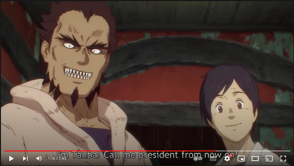
These two are known as Tanba (the guy with the sharp teeth and less rounded eyes who wears a disguise for most of the scene) and Fukuyama (the black haired waiter who's eyes are a lot more rounded), throughout the scene, these two try and mask their true identities (especially Tanba with that fake skin suit) until near the end of the scene when they decide to give Caiman a job working at their restaurant washing dishes. (I think that's what his job is based on the fact that it's what he gets told to do once he's finished eating all the meat pies) I don't really know what ramifications end up happening in the show, which is one of the biggest cons of analysing an excerpt of something without having actually seen the whole thing first (for example, I went ahead and analyse the Sonic OVA first because I was much more familiar with the film as a whole), but my current interpretation is that it means they've taken quite a liking to our "hero", I say this in quotation marks because I asked my friends about whether Caiman was actually the hero of the show (and I suppose by extension, the manga it's based off) and they said he was more of a "morally ambiguous character" (meaning some of the actions he takes in the show and manga may not actually be very heroic, but it'll be fun to find out eventually), and have decided to reveal their true selves to him, especially after they kind of forced Caiman to reveal his true self to them, only for them not to immediately kick him out the building. Although judging from the trailer I saw, he does sometimes tend to eat people, but at the same time this episode does come later in the series, so I'm not sure what the ultimate fate of Tanba (who instructs Caiman to call him "President"), Fukuyama and Kirion (who is the one who walked out of the scene early on, I've neglected to mention him because I literally have no frame of reference as to who this character even is, and I'm typing this part at my house, so I can't ask my friends about it as easily as I would if we were together) ends up being, but I have a hunch they'll either make it to the last episode or end up being killed in some way by these "Collectors" that get mentioned. (I'm going to assume they're bad news for the time being)
With that being said, I think I might conclude my research on the practitioners in this field. I know I said I'd look at three practitioners but to be honest, as I continued doing this part (especially when looking into Mappa studio), I ended up realising more and more that maybe it wouldn't be such a good idea for me to continue looking into films and shows that I haven't even seen or heard of since at that point, it would end up being like writing an English essay on the meaning of a dusty old house I've never read about prior all over again and on top of that, I also want to avoid making the same mistake I did during my FMP last year where I meant to look at a classic Wile E. Coyote cartoon only to accidently analyse one from the 1990s instead of the 1940s. (luckily, both cartoons were directed by Chuck Jones)
Another reason for this is because I'm actually hankering to get on to the practical side of things so that I have my own experimentation to present during my presentation.
The Practical Side Of Things!
For this part, I'll be undertaking a little bit of experimentation of my own in order to see if I can capture the feeling of the anime aesthetic myself, because if I can't capture the anime aesthetic this time around, then I'll be able to take what I've learned here and use it to jump start the production of my final major project and by extension, the new IP I want to make for said final major project.
As such, I feel the first step is to take Super Sheep and do a pose for him in three different styles of animation (where Super Sheep is likely to look relatively different depending on the medium), those being 2D western animation, Japanese 2D animation, and 3D animation. (meaning Dreams PS4/5) With this in mind, let's start off with the 3D Super Sheep since that'll be the easiest to work with, although I did have to contemplate whether or not to include this one since it arguably isn't super relevant, but I ultimately decided to include it in the discussion for kicks and giggles:

In 3D animation, unless you're going for a more stylised look and feel to the animation (and thus stylise your character models) like what The Peanuts Movie or Spider-Man: Into The Spider verse did (especially Spider-Ham from Into the Spider verse), you have to make sure that your character poses can look good from every conceivable camera angle. (even if the shot doesn't necessarily call for orbiting the camera around the character) Speaking of the camera, you can move the camera around a lot more quickly and easily than you can in 2D animation (and that's even with multiplane cameras) due to the fact that everything on screen is a 3D model within a 3D environment. (well, except things like fire, fluids and the skybox which are considered "effects")
Yet another factor to consider when working in 3D that relates to the characters looking good from all angles is to avoid a little thing called "clipping", which refers to when parts of a given model pass through the environment, other models or even parts of itself, the reason this is something that can happen in 3D animation and not something like 2D or stop motion is because the 3D models are all stored in a digital environment and often have minimal collision data attached to them (with the main exception being things like clothes due to how they're often simulated rather than directly animated in order to make things easier):
As such, it means that if the animators aren't careful about how they animate the characters and other props, it could result in things passing through each other like there's a glitch in the Matrix:

A related phenomenon to try and avoid when making something is called "Z-fighting", which is a lot like clipping but it's where textured surfaces that exist in the same space are constantly flickering between each other in order to fight to be the dominant texture:

The reason neither of these things happen in 2D animation is because there, you have to draw every single frame from scratch (unless you're working with 2D rigs in digital software like Flash or Toon Boom) and unless you're deliberately drawing parts of the character passing through each other and/or including 3D elements, it is physically impossible to encounter any Z fighting or clipping issues, and it doesn't happen in stop motion because there, you're using real objects and models. (so clipping and Z-fighting are physically impossible)
We Interrupt This Program To Bring You Another Project Management Update

Ok, so I only ended up getting to look into two practitioners this time around due to deciding I didn't want to go around making false assumptions about media I've never seen before. (since this is the deepest I've ever looked into that particular medium before) While this isn't an ideal situation for a guy like me to be in, I did at least learn a thing or two along the way (especially when it came to Mappa studio and Dorohedoro with it's use of CGI for characters like Caiman), plus I ended up doing something I haven't really done before in the form of asking some of my friends for help on certain bits, I.E: the context behind the meat pies in the Dorohedoro clip as well as finding out about the existence of Mappa Studio and modern anime as a whole (and to think all this came from me realising that Astro Boy had five fingers on each hand), so that was a nice experience (not to mention it was refreshing to be able to ask people who actually know what they're talking about when it comes to anime since outside of Sonic X, Pokemon and a few others, I'm a bit of a newbie here)
Now that that's all been cleared up, it's time to return to the experimentation.
We Now Return You To Your Regularly Scheduled Program
Now that we've seen Super Sheep in 3D, it's time to draw the character in 2D twice, once for the western animation style and once more for the Japanese anime style, and because I'll be drawing the character this time around, it means I'll be going into more detail about how I'm doing things (meaning lots more screenshots):

And the first thing I usually do when it comes to drawing the characters in my usual style is the head, which I normally make very round since it's easier to draw a circle than it is to draw a more realistic head.

for the eyes, I usually tend to draw them to be quite big (especially in Super Sheep's case) because bigger eyes allow us to more clearly see what the character is feeling (especially when combined with the mouth, which I'll get to in the next snipped screen cap), thus meaning the character will be a lot more expressive. (as for why his eyes look like one big eyeball with two independent pupils, I made them that way because I decided to try out the look one day when storyboarding an old project that never came to be because I ended up having better things to do and I ended up liking the look enough to where it became part of his design)

When it comes to a character's mouth, I usually like to draw it off to the side rather than in the middle because it allows me to make it much more clear as to what the character is feeling (whether they be happy, sad, worried, angry, confused, ext), ironically I ended up getting the idea to do this from the Sonic The Hedgehog series, which is a Japanese game franchise owned by SEGA, which is a Japanese company:


The reason I even drew the whole eye in the first place is so that I could then erase a part of them after drawing the extra angry lines. Personally I think this is easier than just drawing the character's eyes being angry already since then I'll be able to decide which direction the pupils will be looking beforehand. (I'll only draw the characters eyes to be certain emotions before doing the pupils if I'm absolutely sure I know where I want the pupils to go before hand):

The reason I say this is the most difficult part to draw is because I often end up making the ear (or both ears if I'm drawing Super Sheep from the front) slightly different shapes and sizes when I don't intend to, thus leading to inconsistent results on that front (luckily, I think I might be getting better at it, as I'm not having to undo and redraw the ear as many times as I used to)

Once I finish drawing the head, I like to move on to making Super Sheep's (or any character I draw for that matter) body since at that point, I can use the head as a reference point for the proportions of the body (plus I find it much easier to draw the body after the head rather than doing the head after the body, although that's just because I've been doing it using he "head first" method for a lot longer), sometime the body can actually take a few tries to get right, meaning it can take quite a few undos before I draw one I'm happy with.

The next part of the process depends on how I'm feeling when I draw the characters, as really the legs and arms could be drawn in an interchangeable order to me since at that point I can just use their relative position from the body as a reference for where they should go anyway, but I was in the mood to draw his legs first, so that's what I'm doing here.

The approach I like to take when drawing the arms these days (in most cases anyway) is actually to draw the hands first because I think doing it this way is much easier than doing the arms first (which is what I used to do whenever I'd draw my characters)

After I finish drawing everything, I usually move on to a step called the "clean up" phase, which is basically where I erase any unwanted lines in order to make the picture look better and get it ready to be coloured in via the fill tool

Once the clean up phase is finished, it's time to move on to the final step in my process, which is to colour the image in using the fill tool and clicking the appropriate spot with the correct colours.

Right away when you compare this new 2D Super Sheep to the 3D Super Sheep, you may have noticed that this Super Sheep actually lacks the depth that the 3D Super Sheep has since, he's now a 2D character again. With this in mind, because of the fact that he's 2D, the animators only ever have to worry about drawing the character (as well as any object, environment and/or effect) from only the angle that the audience will see, meaning they're able to fudge reality more effectively than they can in 3D animation by doing things such as omitting certain features at certain angles or even changing other elements outright depending on the camera angle. (sort of like how I only give Super Sheep one ear unless he's facing directly towards or away from the audience and how I change the way Super Sheep's hair is flowing depending on which direction he's facing)
Another benefit to working in 2D rather than 3D is that you don't have to worry about drawing every single aspect of your characters in every single frame, as when certain parts of the character go off screen and/or disappear behind other parts of them, as far as the animators are concerned those parts can stop existing at that point:

This can save the animators plenty of time as well as plenty of ink and paint, especially back in the days when 2D animators required actual ink and paint in order to colour in their characters, in fact there were even entire departments dedicated to the production and management of said ink and paint:

The last version of Super Sheep I'll be drawing will be what he would look like if he were created for an anime rather than a western cartoon. Of course, you should bare in mind that characters such as Felix The Cat did appear in both western and Japanese cartoons while still retaining his classic design (so technically this would :


With this in mind, I'll be disregarding the existence of the original design for the most part (mainly because I want to keep the character as a blue sheep who wears a big yellow cape) and treating this as if it's the first time I'm ever drawing the character so that there are a few differences in the design. With this in mind, let's get this party started:

Here, I've chosen to do the head first, but unlike my usual western work where I just draw the head as a big circle, here I'm actually attempting a more realistic head shape. (since in general, most anime characters tend to have a more realistic head shape thanks to having a little bit of a bone structure going on) This is actually proving to be quite difficult, so don't be surprised if by the next screen shot it suddenly looks different:

after experimenting with the eyes multiple times, I ended up not feeling happy with what I was making, so I decided to turn to my friends for help and they suggest that I give it a bit more of a cartoonier style, specifically citing the Chibi art style (which is where you draw the characters with really big heads and small bodies in order to get that "cutesy" look)

In this case, I'll be doing things like giving Super Sheep's eyes an actual eye colour rather than making them black like I normally do (since I want this design to look slightly different from the normal Super Sheep for the sake of people being able to tell the difference between the two)

Here, I've decided to take a little bit of inspiration from Goku and have a few rogue strands of wool protruding from different spots on his head, but after consulting some of my friends about it once again, they ended up pointing me in a bit of a different direction:

So my friends ended up pointing out the existence of a guy named Mondo Owada from a game called Dankin Rompa (the only reason I knew of the game before learning more from friends is that it's that IP with the half-white, half-black bear):

Here, we can see that instead of having the hair look like real hair, the artists have decided to make his hair look and feel more like wool (which is actually quite a clever approach considering what type of animal I'm depicting here)


The reason I'm choosing to give Super Sheep five fingers here is as a reference to the fact that I realised that Astro Boy has five fingers on each hand (which in hindsight is pretty obvious at even a passing glance, but I guess I was only realising it at that moment because I was paying a lot more attention to it), so it's more of a weird tribute to Astro Boy as a whole than anything else.

For those of you that were observant during the screen shot where I did Super Sheep's body, you may have noticed that Super Sheep has a neck now (because realistically speaking, lots of animals have necks), so now I've got to depict Super Sheep's neck as being tied around his neck rather than just hanging out of the top of his back like I would normally do (since the normal Super Sheep design doesn't have a neck)


I've decided to make Super Sheep's eyes green in order to pay tribute to the Sonic The Hedgehog series (since Sonic does serve as a part of the inspiration for Super Sheep as a whole and the green eyes were a big point of contention in the fan base for a while)

I'm going to be honest, looking back I think I may have gone wrong somewhere, as I don't think this drawing really captures the anime aesthetic I was going for although my friends seem to see what I was going for, but still, as someone who doesn't watch too much anime, I still feel as if this design I made doesn't hit the mark as it doesn't naturally click as an anime character, it's almost as if a person from the west was trying desperately to capture the aesthetic regardless of the actual context behind what makes real anime characters so appealing in the first place. (oh, wait a minute) Two pieces of feedback my friends did end giving me in order to improve upon this design were that I could have made the limbs a little bit thicker since quite a lot of anime characters (especially the more cartoony looking characters like Astro Boy) tended to have much thicker limbs in general (in fact, feedback from my friends while I was making this design was actually part of what gave me the idea to abandon the more realistic head and eyes in the first place):

One of them also mentioned how I could have included an extra line on one of the hands near the thumb in order to add a little bit of extra depth to the hand without going super overboard with detail like I did on Super Sheep's wool. (yeah, let's just say that when turning existing characters like Sonic and Felix into an anime, there's a reason they don't mess with the character design too much)
Like I said at the beginning of this little research expedition, anime and 2D western animation are fundamentally one in the same in terms of the tools (those being either pencils, ink and paint or a computer depending on whether you're doing cel animation or digital animation respectively), but where the two differ is actually on a cultural level, as in Japan, animation is actually a lot more widely accepted as a medium for telling serious stories than it is over in the west where it's mainly viewed as "kids stuff" (and the 80s were no help in this regard either, as many western cartoons at that time existed mainly to sell toys to kids thanks to the deregulation of entertainment at the hands of former U.S president Ronald Regan):

Another difference between anime and western 2D animation is that while we've more or less relegated 2D animation to the small screen (because the grand majority of what we make is computer generated these days), Japan has actually continued to utilise 2D animation in even some of their more recent movies, with films such as "Mirai" (which I'm just finding out about now after googling modern anime films in order to find an example I could name) being released in Japanese theatres in 2018:

Another difference between anime and 2D western anime is that while for the most part the west is fairly content with playing by the rules for the most part (since a lot of them are created with the intention of bringing in massive profit margins), anime creators (especially in more recent years) have actually been experimenting with adding in computer generated elements in some of their shows much like what the west used to to with theatrically released 2D films of the 90s and mid 2000s (no, I'm not calling them the "noughties" because I think that sounds stupid) before abandoning the medium entirely because Disney and Dreamworks didn't make enough money off of films like Home on The Range and Sinbad: Legend Of The Seven Seas to justify continuing with 2D moving forward (although we do get films like The Mitchells vs The Machines which actually puts 2D elements in a 3D film), but I think if they continued to experiment with this stuff beyond that point, we could get things like what we see in Dorohedoro and the 4th season of Attack On Titan where the CG can sometimes be mistaken for actual 2D animation (much like I did with Spider-Ham in the trailer for Spider-Man: Into The Spider-verse):

Of course, because the two are fundamentally the same it means a lot of what I said about western animation applies here but instead of ones and twos, a lot of anime is animated on threes and fours while occasionally switching to ones and twos, so I won't be repeating myself too much on that front.
With all that said and done, it's time to move on to the second piece of practical experimentation, which will involve...
Speed Lines/The Blur Effect That Happens When The Characters Are Doing Things Really Fast
What exactly am I talking about when I say speed lines? Well you see, it's an effect that's predominantly used in a lot of action scenes where whenever the characters are running, jumping or even falling down, the background will actually turn into what I can only describe as a stream of colour with motion lines spanning across the whole screen:

The main reasons that a lot of action heavy scenes will use speed lines boil down to budgetary restrictions, since there's only so much of the background that gets drawn at once that the only other way to make these shots work is if they loop the background like what shows such as The Flintstones would do whenever there's a travelling shot:
The other main reason it's done is because for as much as this helps out with the budget, it also works to add in a little bit of extra flair to the scene, since it implies that the camera has to move so quickly that the entire background becomes nothing more than a nebulous blob like in this scene in Sonic X where Sonic is racing Sam Speed (actual name of the character) in his race car to see who's the fastest (I think we all know who the winner of that race would be):

Now that I've laid down the general ground work of what speed lines are in the context of anime, let's see how I ended up doing on that front.
So for this experiment (which I actually did before the day even began because I'm currently sick while writing this and I had nothing better to do), I wanted to see if I could recreate the speed line effect in a 3D environment like Dreams PS4/5. (since I already know that's what I want to use to make my Final Major Project)
In order to get the effect to move and animate in the way I wanted it to, I decided to go ahead and use Dreams' paint tools, which I've used in the past to make things such as everyone's mouths and even their eyes (specifically their pupils), in combination with the surface snap guide (because there's no way I'm going to be able to make it stick to the surface without creating small wrinkles here and there) to create a stroke of paint flecks that goes from one end of the default platform to the other, from there I would copy and paste that same stroke in order to make the rest of the effect where I would then use the tweak menu on all of them at once via the multi-select feature to actually get the paint effects moving. However, I figured that the effect I wanted to go for wouldn't work nearly as well I would hope if I had just one pure colour that ran through the whole thing, so I decided to actually utilise the colour wheel, specifically the part where you can actually mix different colours together, in order to create a custom colour that cycled between different shades of the same blue colour, although with the part that's supposed to represent the grass, tweaked the hue (meaning I changed what part of the colour spectrum it draws from, so now instead of blue, it's green) in order to make it green, however the variation of green shades here now reminds me of the chequered grass from Green Hill Zone:

Getting back on topic, I figured this would help make the effect a little bit more obvious. (personally I think this works quite well to that effect because it makes it obvious the character is moving quickly while not being super distracting in any meaningful way)
Afterwards I decided to animate Super Sheep running, but before we discuss that any further, I just want to address something about the model seen in this stream. For those of you that are particularly observant, you'll have noticed that Super Sheep's model looks slightly different than it did in the previous experiment. Well the reason for this is because in my spare time, I've been going in and trying to improve the models for some of my characters, particularly those in the Super Sheep line up as those characters are going to be part of "Super Sheep in Holly-weird Hijinks" (which if all goes well and I balance my time correctly, I should have it out by the time I'm about to head off to Edge Hill University to learn the professional tools and end up having to transition away from using Dreams PS4/5), I did this by giving them alternative outfits (and by making said outfits fully 3D modelled rather than just 2D textures) and even doing things like making Super Sheep's wool (by which I mean the wool on top of his head) separate from the rest of his head so that I could make it match the orientation of the camera like the mouth does. Now that that's been addressed, let's get back on track.
Animating Super Sheep's run was actually one of the most difficult bits of the entire process, not because of any actual difficulty of doing so, but because it was the part that took the most effort to do out of the entire process of making this experiment. (especially since I only animated a simple running loop)
Going back to the actual star of the show here (that being the speed line effects), I only did one side of it since I originally planned on the camera angle being more of a side on view but I didn't quite like the way it ended up looking (since it meant you couldn't see Super Sheep's pupils), so I changed the angle to be a bit more of a profile view. This of course meant I'd have to add in extra speed lines for the top, bottom and left of the screen, as well as a blue text box behind everything so that the white sky wouldn't be visible. Luckily, I could simply copy and paste the first set and then change them accordingly by making the "ground" set exclusively green and the "top sky" set exclusively blue. This was the case because earlier, I'd grouped the entire speed line, thus meaning that I would have to scope into that specific group in order to edit the colour scheme (thus meaning I don't have to worry about accidentally editing something else from outside that specific group)
I decided to make the sky white because I really liked how it made Super Sheep's colours pop out more than they did under a blue sky because with a bright blue sky, everything would have a slightly blue tint to it, thus washing it out a little bit even with the colour saturation turned all the way up (although that could be due to some of the settings I picked for the grade and effects gadget in general):


After all was said and done, it was time to place the timeline and camera into the scene, let it roll for a few seconds, record the results and then put the whole thing together in the "editing" phase. (although one thing I wanted to have was a few additional 2D lines whizzing by to accentuate the sense of speed, although due to the settings I applied to the camera, it didn't end up coming through like I wanted it to) Looking back however, I don't think that a cuboid shape is really the best choice when it comes to the shape of the speed line tunnel, but I can always do further experimentation with that once the FMP starts, as right now I've got to make sure my PowerPoint doesn't exceed 8 minutes. (while at the same time making sure it doesn't last less that 5 minutes)
As for the editing phase, it was nothing too remarkable, as all I really did in terms of actually editing the whole thing was adding in a fade in and fade out and the theme song from a show called Mega Man NT Warriors: Axess (yes, that's spelt with 2 s' at the end), although the reason I added that song in was actually because it was used as the intro theme for the original version of a fan made web series called "Super Mario Bros Z", a fondly remembered series that uses video game sprites ripped from various Mario and Sonic mostly (mostly the Mario and Luigi games and the Sonic Advance games) in order to tell a story where our heroes (Mario, Luigi and Yoshi from the Mario series along with Sonic and Shadow from the Sonic series) must gather the Chaos Emeralds before Mecha Sonic from Sonic The Hedgehog 3 & Knuckles can use them to destroy the Mushroom Kingdom:
But other than that, there's not really much I can say other than the editing actually took me a lot less time than I thought it would, mainly because I thought more time had passed. (the process felt like it took half an hour when in reality it only ended up taking around 16 minutes)
Oh, By The Way I Got A Third Piece Of Feedback On My Super Sheep "Anime" Design
So while I was writing about what speed lines are, I ended up getting a third piece of feedback on that "anime" Super Sheep design I made 2 days ago from one of the people I've been turning to for help as of late, and I think it might shed a light as to where I may have gone wrong initially. While he said he thought it was great, he actually brought up how a lot of traditional anime has "more of a cel shaded look to it."

The reason I think this sheds a light on what may have gone horribly wrong with my "anime" Super Sheep is because of the lack of shading going on with him:

You see, the reason I generally don't do shading very often in my 2D artwork is because a lot of the aesthetic is rooted in western cartoons, specifically television cartoons which generally don't have shading either (or at least, they use it quite minimally):
Meanwhile, anime works that are produced in Japan tend to have a little bit more shading going on (especially the newer stuff):
The reason I bring this up is because it's given me a bit of a clue that highlights where I went wrong when making that design, as while the amount of detail is fairly sound (if a bit overboard in places), it's the lack of shading that brings this specific design down, as while a minimal amount (or even a lack) of shading may be ok in a typical western cartoon, if I wanted to capture the style of anime, I probably would have needed to put a lot more effort into the shading like I did back in the fashion project (and maybe change the green eyes and mouth so that they're closer to the normal Super Sheep in the first place), since then I would have been able to better make Super Sheep into an anime style character.
We Interrupt This Program To Bring You Our Strangest Project Management Update Yet

Ok, so I've been doing a lot of this under the impression that literally everything was due in this Friday (the 11th of February) since the brief lists all three tasks as being due on the same day:

With this in mind, I was actually starting to worry that I wouldn't have much time on my hands to get the evaluation finished to a high enough standard like I usually manage to, since I'd be too busy haphazardly preparing an emergency video presentation in case I ended up remaining ill for the whole week. Luckily, when I mentioned it to my tutor, I ended up getting a bit of reassurance in this regard:

With this in mind, I think I'll take today to discuss a little bit about the importance of art-styles and Aesthetics in media on a more general level as a fun bonus (I know this means my points won't all relate to anime specifically but what I say during this will apply, and I'll try to use examples from anime, but I don't really own any anime themed games to use as an example for what happens when the aesthetic is disregarded) before doing the evaluation later on in the day. So without further ado, let's get this brief tangent started.
We Now Return You To Your Regularly Scheduled Program, Currently Looking Into Art-Styles and Aesthetics
The Art-Style of any given piece of media is responsible for dictating how things like the characters look, for example, something like Attack On Titan could be described as having a more detailed and realistic looking art-style:

Meanwhile, a show like Baby Felix and Friends would go for a more cartoony art style where the characters aren't anatomically accurate to real humans (or even real cats for that matter):

With that being said, why is it that one show can have lots of realistic shading while the other one can't? Well you see, that has something to do with a little thing called the aesthetics. The aesthetics of a given piece of media, while related to the art style, are actually a set of principals that artists will typically follow when creating a specific piece of media in order to make sure that their work lines up nicely with that specific piece of media on an artistic level. For example, in a show like Dorohedoro where characters such as Caiman 3D characters being rendered in a 2D environment, the creators would have to make sure that the textures and shading on the model closely match that of the 2D characters so that he doesn't stick out like a sore thumb:

With this in mind, why is it important for media to even have specific aesthetic choices and art-styles in mind in the first place? Well you see, if you don't stick to a specific set of aesthetic choices or pick one art style for your work, then the whole thing would likely fall a part on an aesthetic level, and to demonstrate this, I'll be using Sonic Generations as an example of when aesthetics and art-style are adhered to and Garry's Mod as an example of what happens when art-styles and aesthetic choices clash:

Smash Bros references aside, let's get down to business:

here, we can see that the game Sonic Generations goes for a rather colourful aesthetic but keeps in some small elements of realism here and there as a nice bit of detailing in order to make the world feel more real. (I.E: stone pillars feeling like stone pillars and Green Hill Zone's trees retaining their original look but with more added detail on the trunk and even the leaves) With this in mind, Classic Sonic still fits in quite well within this game despite not being as detailed because he still sticks to the rules of the more colourful aesthetic the rest of the game uses, plus it allows Classic Sonic to pop out from the background enough for people to take note of him first rather than the background since he and his more modern counterpart are the central points of focus in the game. (since you play as both Sonics throughout)
With this in mind, I now want to compare this aesthetic to another game called Half Life 2. (I know I said I'd be using Garry's Mod next but stick with me, this is going somewhere):

Here, we can already tell just by looking at it that Half-Life 2 looks very different from Sonic Generations because unlike Sonic Generations which strikes a balance between realism and cartoony (since Sonic Generations is meant for both younger players and long time Sonic fans such as myself), Half-Life goes all in on the realism angle, as things such as Gordon Freeman's (the guy shooting the combine's helicopter in this screenshot) hands, the SMG (sub-machine gun) he's holding and even the hills and trees in the background look more like something you'd find in our world than Sonic's brown chequered boarded cliffs hills and geometric palm trees. With this in mind, what happens when we put Classic Sonic's character model into the Half-Life map using Garry's Mod?:

Yeah, all of a sudden, the big bright blue cartoon hedgehog looks very much out of place in this more realistic environment. The reason for this is because I simply spawned the model for Classic Sonic from Sonic Generations, which I downloaded off of the Steam Workshop for Garry's Mod (since that's where a lot of mods for the game can be found), into a part of the Canal map where you fight that combine Helicopter in Half-Life 2 without any regard as to whether or not Classic Sonic was even meant to be there in the first place, but the aesthetic clashing doesn't stop with just putting cartoon characters into realistic environments:

Here, we can see a bunch of gaming icons (and Strong Bad from the Homestar Runner series) all standing in the "2Fort" map from a game called Team Fortress 2, which goes for a more cartoony aesthetic than Sonic Generations. With this in mind, you'd think Classic Sonic would finally fit into place right? Well you're wrong, as here in this image we have (from left to right) a bean person from the game Fall Guys: Ultimate Knock Out, Mario from the Super Mario series, Alyx Vance from the Half-Life series, the Heavy Weapons Guy from Team Fortress 2, Strong Bad from The Homestar Runner series (who's model was ripped from the Tell-tale games based on the series), Sora from the Kingdom Hears series (specifically the one from Kingdom Hearts 2) and Steve from Minecraft, and on top of that, there's also me standing there with the Physics Gun (which by default looks exactly like the Super Gravity Gun from Half-Life 2) overseeing the whole mess.
Out of all the elements we see here, the only character amongst this particular lot that looks like he belongs here is actually the Heavy Weapons Guy, since he perfectly matches the cartoony aesthetic of Team Fortress 2 (due to him actually being from that game) while other characters such as Classic Sonic, Alyx Vance and especially Strong Bad (mainly due to the "Cel Shaded" look he has going on) and Minecraft Steve (since he's so blocky) end up clashing with each other and Team Fortress 2's visual style (since Heavy's visual design goes for a more 20th century commercial illustration look look while Classic Sonic's is inspired by characters such as Felix The Cat)
Of course, there actually are some cases where visual styles clashing with each other is actually part of the point, since at that point the main characters not belonging in their current setting can make the audience feel just as alienated as the characters. A brilliant example of this is New Donk City from the game Super Mario Odyssey:

Of course, part of the reason that the more realistic humans in New Donk City are able to clash with Mario, who is ostensibly the same spices as them yet looks more cartoonish than they do, is because while this is a clash of art styles, it technically still follows the rules of Mario Odyssey's aesthetic because much like Sonic Generations, the game's cartoonier art style is also complemented with added details that make it look more realistic than most other Mario games, with the exception of the Luncheon Kingdom where all the food is very polygonal in nature, yet it still works because they made sure not to add in too much detail into Mario so that even when he does look out of place, it's ok because he's just out of place enough to where it's jarring yet it doesn't break the aesthetic.
With that, I think I'll end this tangent here because if I go on any further we'd be here all day and this research unit is supposed to be about anime, not video games or western cartoons. So without further ado, it's evaluation time.
The Evaluation
well folks, here we are again. The end point for the research where I look back on everything that I've done up until this point and talk about what I think went well and what could have been improved upon, but before we begin, I just have to say that this has been one heck of a roller coaster ride for me, as not only was I looking into a medium I was only passingly familiar with, but I also ended up drawing upon the knowledge of my friends for help in certain areas, as they ended up helping me discover Mappa Studio and Dorohedoro in the first place, which ended up helping me gain a proper frame of reference as to what modern anime is like so I have them to thank for pointing me in the right direction when I didn't even realise I needed it, and to think all that came from me realising that Astro Boy has five fingers and telling my friends about it.
But now that I've established what's going on here, let's get started by asking the big question.
Why Did You Choose Anime Over Western Cartoons?
Well, if I'm being honest with myself, as much as I enjoy western cartoons, I've already looked into those cartoons multiple times both on this course and during Creative Media Level 2, so if my specialist study were to be on those cartoons again, I feel like I'd just be repeating myself when to comes to certain aspects such as the techniques used, and there's only so many times I can talk about Pixar or Walt Disney without repeating the same points over and over again.
Sure, I could have talked more about other studios such as Aardman, Cartoon Network, Illumination and many others on this theoretical go around, and doing so would have probably been much easier for me too (since I know a fair bit about those studios out of the gate), but would doing this even lead to me being able to work on a new IP that's not a direct clone of another cartoon, whether it be an existing show and/or one of my own? Probably not, and on that same token I don't want it to be a part of my already existing IP because I've already used Super Sheep for literally everything else this year except the Sandwich Shoot since the rules there didn't leave me any leeway to even include my characters in the mix. You could probably think of this like the "Jack's Lament" scene in The Nightmare Before Christmas where Jack longs for something new and different, except nowhere near as sad and take out the parts where he sings about being the best in his field. (and even the parts about being famous and being able to remove my head for that matter)
So How Was Looking Into The Subject Of Anime?
I'll be the first to admit that when I first started looking into this subject, I'd gone into it with the pre-conceived notion that the main differences between it and western cartoons was that anime had a more detailed art-style and all the characters were either magical girls who lead double lives or dudes with wildly colourful hair going on adventures in far off lands (although come to think of it, the fact that I've seen shows like Sonic X and Pokémon as a kid and have been aware of the existence of Baby Felix and Friends should have immediately prove me wrong on this front), but as I got deeper and deeper into my research (especially after my friends helped me discover Mappa Studio), more and more of what I ended up finding and talking about ended up shattering those pre-conceived notions entirely, as there ended up being a much wider variety of styles than I originally thought, with everything from shows about a guy who wants to stop being a CGI lizard man to a show about a younger version of a cartoon cat learning lessons with the help of himself as an adult (and yet they never touch upon the time paradox palooza that would cause despite explicitly saying that adult Felix is from the future) and even one about a friendship that blooms with students who like jazz music
With all this in mind, while I've known that on a fundamental level anime and western cartoons use a lot of the same tools (those being paper, pencils, ink, paint and now even computers), I now have much more of an understanding of where the actual differences between the two mediums lie, it's all rooted in the cultural differences between Japan and the west (specifically in how both view the medium of animation as a whole):

As for my actual research, I'd say I've finally gotten a bit more of a grip on timing everything out so that I'm not stuck on one part for too long, whether it be practitioners, experimentation or even statistical analysis. This is probably because I actually had a project management table for the research phase, which under normal circumstances I wouldn't have done since research would have been one part of a grander project (although with the way I'm structuring this as a prelude to my Final Major Project, I'll be able to copy and paste most of this for my FMP and skip a bulk of the research phase, thus allowing me to jumpstart production)
In terms of the actual contents, I feel like I did a fairly good job describing the differences between western cartoons and anime in terms of both aesthetics and demographic differences, as I decided to use Mickey Mouse and Goku (two of the most recognisable characters in their respective mediums) as a nice reference point as to what a typical western cartoon character and what a typical anime character looks like respectively, although getting a video of the Frieza fight scene from Dragon Ball Z ended up being a bit more difficult than I anticipated due in part to Toei's constant copyright claims (as I ended up finding out thanks to my friends telling me about it), so after replacing the video once, I just chose not to bother in the end, since any replacement video I get today will more than likely be gone tomorrow or even several hours from now unless it comes from Toei themselves. The reason I even did that was to compare it to the short known as "The Little Whirlwind" by Disney, although I originally chose to look at "Gone To Pieces" but then decided to replace it so that both pieces of animation could be on the same playing field, since both The Little Whirlwind and Dragon Ball Z were originally animated using traditional cel animation, where as Gone To Pieces was created using digital 2D animation.
When it came to the statistical side where I looked more into the demographics of anime as a whole, I would say I did a little bit better on finding more statistics than I did last time (even if both sets of statistics were technically based on the same study), but looking back, I think I could have made this part way better if I'd also found a similar study but for western cartoons rather than anime so that I could more directly compare the two mediums in terms of demographics. The closest I could find was related to the viewership of various TV networks such as Cartoon Network but even then, it didn't detail specific shows, just viewership of the network as a whole, so I once again chose to ignore it for the sake of keeping things fair. Speaking of the statistics I found for the anime side of things, there actually were a few twists and turns I didn't expect to find along the way, such as Frozen even being on this chart and beating the likes of Dragon Ball in terms of recognition percentage, although that one could be chocked up to the fact the study was done in Japan where the definition of anime is an abbreviation of the word "animeshon" (which itself is the Japanese word for "animation"), meaning stuff like Frozen and even Wallace and Gromit would have no problem counting as anime works, so really that particular turn was more of a cultural whiplash more than anything. (since I'm so used to the term "anime" referring exclusively to Japanese animation)
How Was Looking Into The Practitioners This Time Around?
When it came to looking into the practitioners who work on anime, I didn't fully know where to turn to at first, since I was coming at this from a fairly fresh angle. Sure, I might have known about people like Hayao Miazaki and studios such as Toei Animation, who I originally wanted to discuss as an excuse to talk about the intro cutscene for Sonic CD before discovering that Studio Junio actually helped them handle the animation for said cutscene, but that probably would have been low hanging fruit and the fact I couldn't get a lot of solid information on Studio Junio meant one of my potential excuses to talk about Sonic got dashed. I also considered looking into a studio called TMS entertainment, who animated Sonic X (because then I would have had another excuse to talk about Sonic), but eventually I landed on Studio Pierrot, who were the people behind the Sonic The Hedgehog OVA that got turned into a movie. (meaning I'd finally found a good enough excuse to talk about Sonic)
After I'd finished talking about Studio Pierrot, I ended up finding myself at the same crossroad I did before, and since I didn't want the entire thing to be me talking about different versions of Sonic (since that would probably get a bit repetitive even by my standards), originally I was considering looking at the likes of Hayao MIazaki (the man behind Spirited Away and Ponyo) or even Osamu Tezuka (the guy who created Astro Boy) at this point since I didn't know where else to turn to, but then I told my friends about the "stunning realization" that Astro Boy has five fingers on each hand, which then prompted them to introduce me to Mappa Studio (the people behind Dorohedoro and the fourth season of Attack On Titan), which ended up becoming really critical in helping me understand what more modern anime looks like. Of course, the main improvement I would make here is that I'd actually go ahead and talk about a third practitioner (preferably an individual since the two practitioners I did end up looking at were companies) since earlier I did promise that I would do so and I never got around to it because of time constraints (so for as much as I'm getting the hang of making sure I get everything done within each week, there still ended up being a ton of information I had to just leave off the table)
How Was Getting Help From My Friends, And Why Now?
I'll be the first to say that for as strange as it was at first (especially since it came as a result of me realising Astro Boy has five fingers on each hand), it was actually quite nice to have people who are experts in terms of the subject matter I could turn to for help if I didn't understand a particular element, I.E: the context behind the characters in Dorohedoro when I was analysing the scene with the meat pies in episode 8.
It also helped to have my friends help me by influencing the direction I ended up taking when drawing the anime style Super Sheep by suggesting I try and keep it more cartoony rather than realistic like I originally tried to do (one of them even gave me reference images to pull inspiration from):

Looking back at the results of my anime Super Sheep, while I wouldn't call it my best work, I know that it probably would have been a lot worse if I'd gone with the more realistic direction I wanted to originally before asking my friends for guidance, especially since I have next to no experience with realism.
How Was The Experimentation Phase?
Speaking of the experimentation, I actually enjoyed what little I ended up doing in the end, as I was able use Super Sheep in order to discuss some of the foundational differences between 3D animation, western 2D animation and Japanese 2D animation after using said mediums to draw/pose Super Sheep himself, although for all three I chose to keep the same pose in order to make the comparison much easier in the PowerPoint Presentation I've been putting together at the same time:

The 2D Super Sheeps were simple enough to make since I simply drew them both in PIxlr like I normally do when drawing the character, but the 3D Super Sheep ended up being a little bit more complicated (although not necessarily difficult) because once I finished posing him I had to take a picture of the screen in front of a pink screen so that I could then take that picture into Pixlr and have an easier time making it transparent like all my 2D work, although if you look closely at the outline you can still see bits of pink since I wanted to get this done quickly for the sake of the experiment and it was my first time doing such a thing in the first place.
The main point of improvement here is definitely with the "anime" Super Sheep, because for as detailed as he is (especially with the wool), the lack of shading in combination with the changes I made to the character design in an attempt to make him more anime-like (mainly making the eyes green and moving the mouth to the middle rather than to the side) ended up causing this design to not work out as well as I would have liked, although with that being said, I can take what I've learned here and use it to make sure the character designs of whatever I end up deciding to make as the new IP don't fall into those very same pitfalls.
As for the "speed line" experiment, I feel like that one was actually a rousing success, as I managed to more or less achieve the desired effect quite quickly by using Dreams' paint tools and I even got to try mixing various shades together to make the movement of the "background" more obvious. In fact, I'm so proud of how this turned out that I'm starting to wonder why I didn't just create a looping background using the paint tools back in Captain Cartridge and Friends in Operation Compact Disc, as that way I wouldn't have to adjust the camera in order to hide the fact the characters were actually stationary as much since the doors would be hidden by the blurry backdrop, although in this particular experiment I did end up having to improvise with a different camera angle after finding that I couldn't see Super Sheep's pupils from the side (yeah, that's one of the problems with working in 3D, certain features of the characters stop being easy to see at certain angles unless you're character models are heavily stylised) but other than that, I didn't run into any real issues.
The PowerPoint Presentation
Ok, I may not have mentioned much about the coinciding PowerPoint presentation since much of it is based on what I've been doing in this blog, but I've been working on it more or less at the same time as I've been working on this big ol' piece of research. With this in mind, making this was surprisingly easy since all I was really doing for most of it was slapping a bunch of images on a few slides while adding a bunch of both western and anime characters for the sake of comparing the two styles while also having characters who have appeared in both anime and western cartoons (mainly Mario, Sonic and the PowerPuff Girls) in order to let others compare the differences between them (with Felix The Cat in the middle because aside from a change in his finger count, he looks more or less the same across both styles of animation):

Personally I quite like the way this PowerPoint looks as a whole, but if you want to take a look at the full thing, you'll find it down below:
I can't really comment on the presentation itself because it hasn't happened yet so I'll have to make an update after the fact.
In Conclusion
While doing this unit may have started out quite tough because I didn't have much of an understanding of the medium but after getting help from my friends who actually know what they're talking about when it comes to anime, things certainly got a lot easier from there, so if I learned anything from doing this, it's that it's OK to ask others for help when you don't understand something fully, as you might end up getting insight into parts of the subject matter you may not have considered when doing everything on your own, as I've often done in the past. (maybe if I thought to ask for help earlier in the course, I could maybe have avoided the "Wile E. Coyote" incident where I confused a cartoon from the 1990s with a cartoon from the 1940s)
With this in mind, I think this unit has helped me gain more of an appreciation for anime as an art form and may even consider checking some of this stuff out once I get a chance in the future.
But now that this little research unit is more or less over with me being only one day away from the deadline (the closest I've ever been thus far), I can't wait to get started on my Final Major Project, although because I'll be on holiday for most of the half term so I won't be able to get as much of a head-start as I would like, meaning I'll probably be doomed if I don't get started fast. (luckily this bit of work can be copied and pasted into my FMP in order to skip much of the research phase. (so that'll be a nice offset I suppose)
So How Was My Presentation?
Ok, so I'm back from my holiday, to make a long story short I had a great time even though as a result I never got the chance to actually rehearse my presentation in the end since I also ended up in France near the end. (the storm caused my flight to divert right as we were coming into land and I had to spend the night in France)
Now that that's out of the way, how did I actually do when presenting my presentation? Well the lack of any actual rehearsal phase ended up leading to the whole thing turning into a big disaster, as I ended up stuttering the whole time like I was suddenly turning into Porky pig and since I never got to refine my points because of the lack of rehearsal I ended up going well beyond the five to eight minute window meaning I've managed to screw the whole thing up right at the finish line and the fact I ended up going first probably didn't help matters. (although my friends were very supportive about it) Maybe if I had a little bit of time to rehearse the whole thing (and perhaps if I went a little bit later) maybe I could have at least cut the whole thing down to around eight minutes although with how little time I would have ended up with to come up with a new way to make the whole thing flow naturally (what with these presentations being done over the course of this week and the fact I've got to actually start my final major project), I probably wouldn't have been able to improve much on the stuttering (so it would still have come off like Porky Pig was presenting the whole thing):
This download button is for the version I presented to the class
Now that this unit is finished, it's time for me to actually start my Final Major Project at long last (although things have changed ever so slightly since the last time I was at this point, so I may have to adjust my plan of attack)


Comments